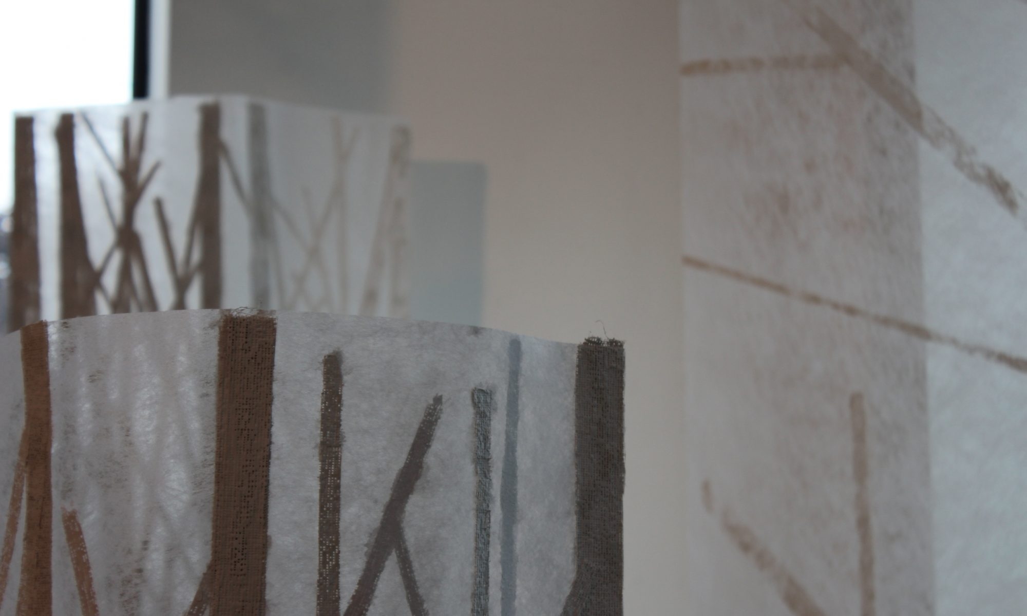
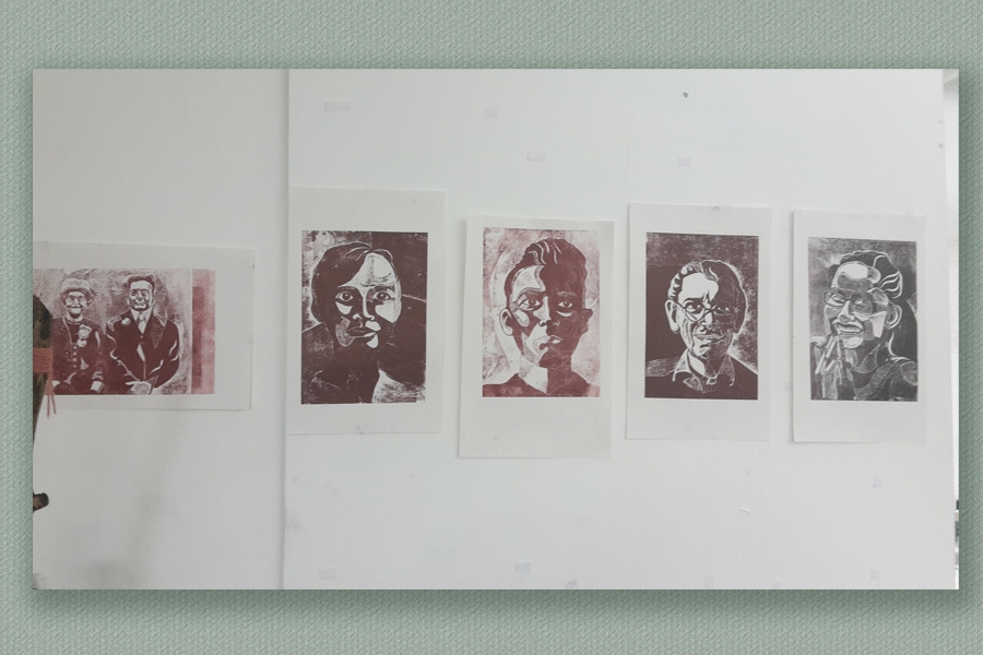
I am truly delighted with the way these have turned out and frankly rather embarrassed by the number of oos and aahs they are provoking in the studio but, I suppose that helps me to evaluate them less subjectively. I pinned them up on the wall next to my studio space (they’ll take ages to dry and the drying rack is full). I must admit, I was quite startled by seeing them from the outside of the studio window when I was stuck at the traffic lights this morning. The series certainly seems to have impact.
A startling array.
Never mind how startled I was, …… nothing compared to my husband’s face (no clue about the prints in production) when his image suddenly appeared on Instagram! #foundation.carlisle
Quite surprising to see yourself like this online!
Extension Activities.
I have been asked (told) to think about how one might mount/present/hang these, following a lengthy but spontaneous ‘crit’ with PT and KT about them.
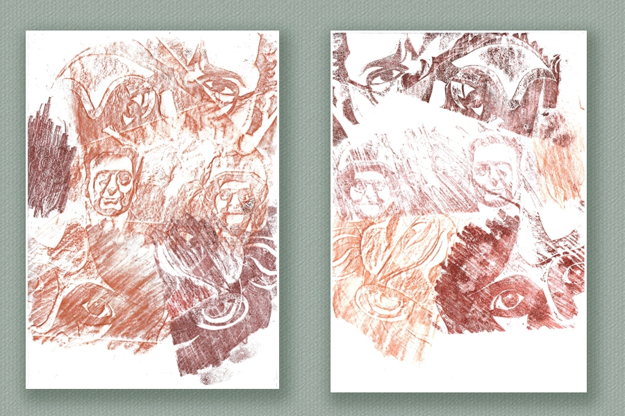
Learning the force of ‘the hovering hand’ : KT has found it difficult to restrain herself from ‘dabbling’ in this print process ha! ha! Oh well there you go – the down-side of teaching lol. But words emanated from the mind that was controlling ‘the hovering hand’ and her comments resulted in me doing some ‘scrapping’ off the ‘spent’ printing plates – sort of frottaging bits of them with a baren.
This playful extension may have been a bit inspired by the frottage I did of each board before printing from them. It seemed a nice way to preserve the virgin plates in a bit more interesting way than captures from the photocopy platen.
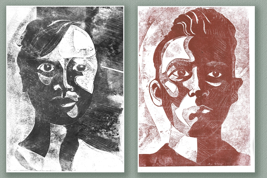
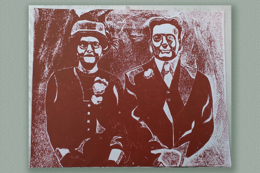
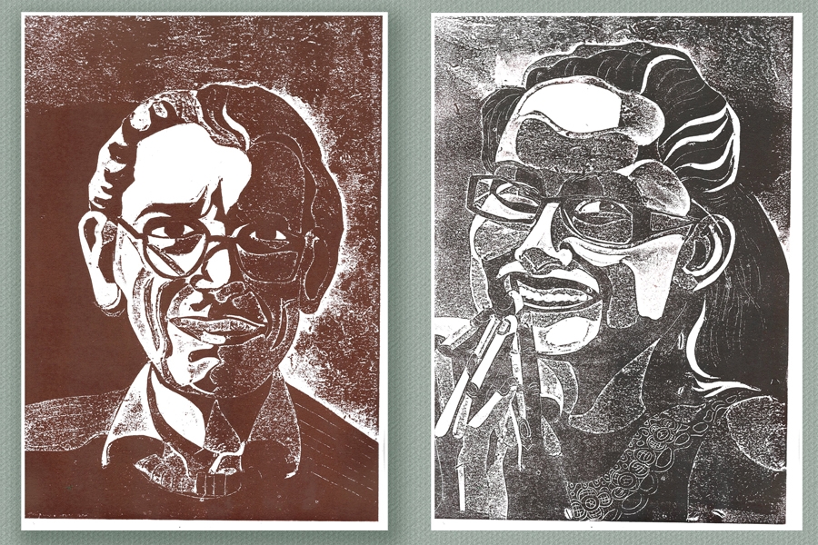
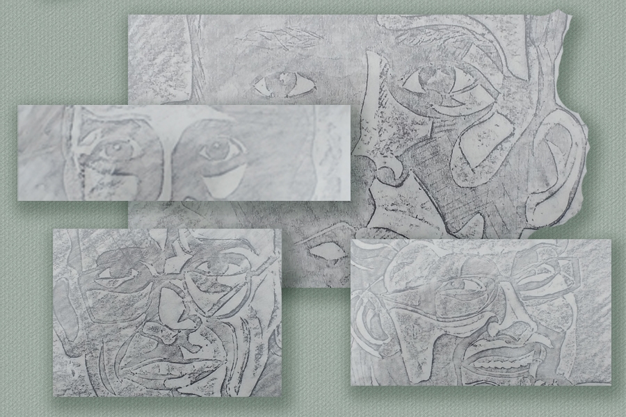
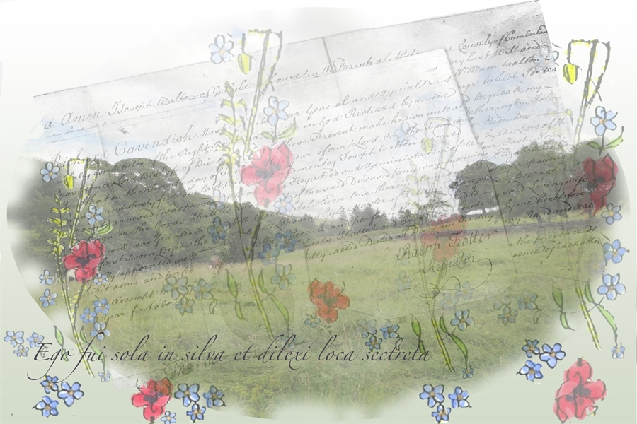
I feel that these have been successful in achieving a liminal effect using the layering and rubbing away palimpsest idea – representing the boundary between life and death. It has been a very time consuming process with a lot of decisions to be made about exact levels of opacity after the pixel level image editing. PT has given helpful support and little nudges in the right directions… particularly about font choice, colour etc and, finally in a discussion about the paper stock to use for printing.
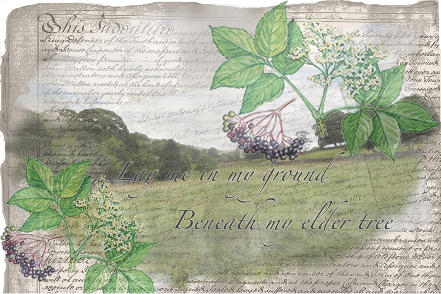
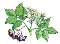
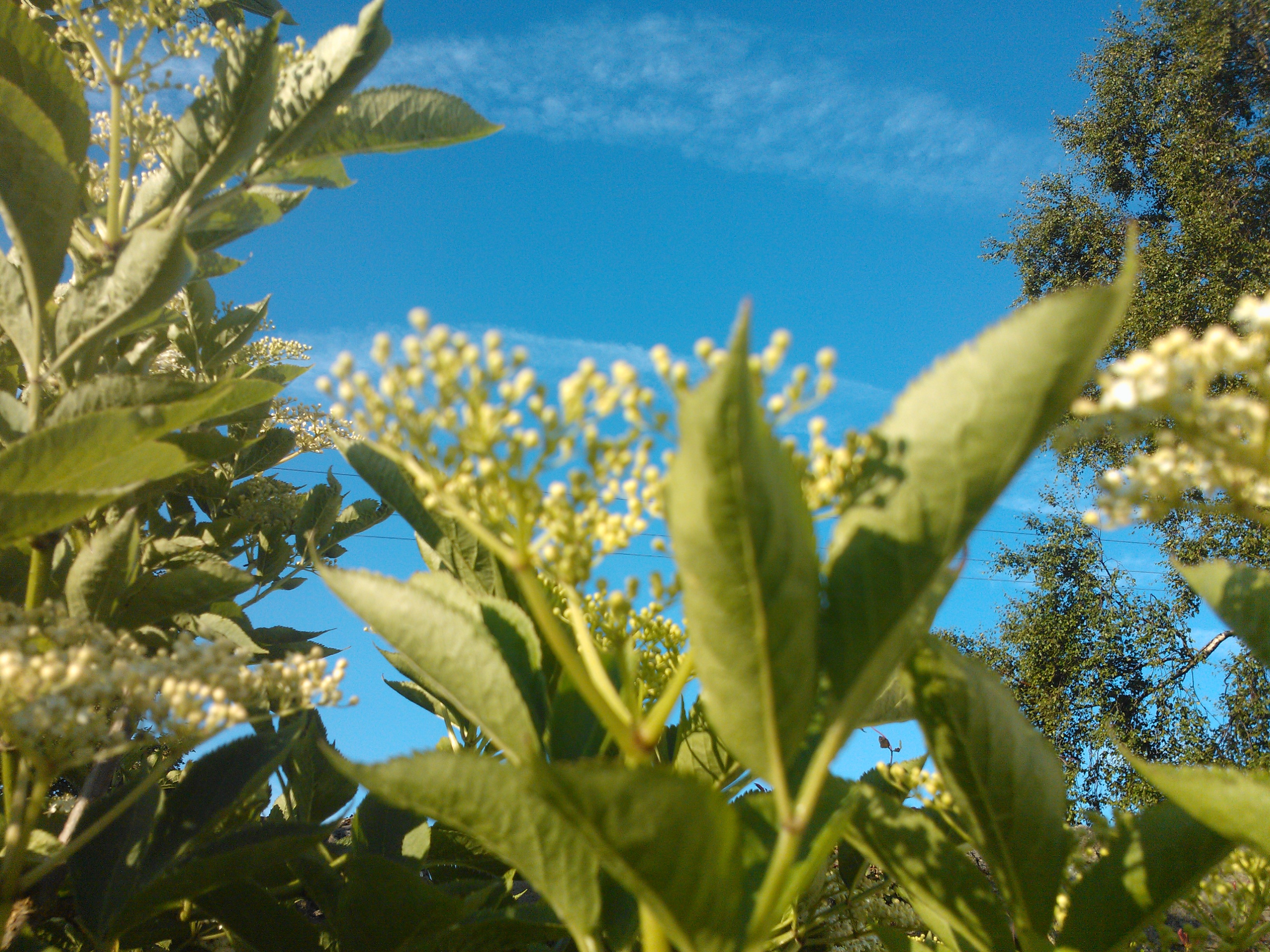
I prepared a set of image files to take into workshop, material that I have decided to experiment with for my book. Since, last post, my ideas have been taking a more tangible form in my mind so I went into workshop armed with the deed scans, some images of elder flowers and berries, my poem script and some pictures of the landscape at home. The first few workshop activities were within my familiarity with Photoshop (I have used it for several years now) but I followed them through at the beginning just to find my way around the Mac environment and the CS6 version mounted there …. mine being a humble CS3 on Windows at home!
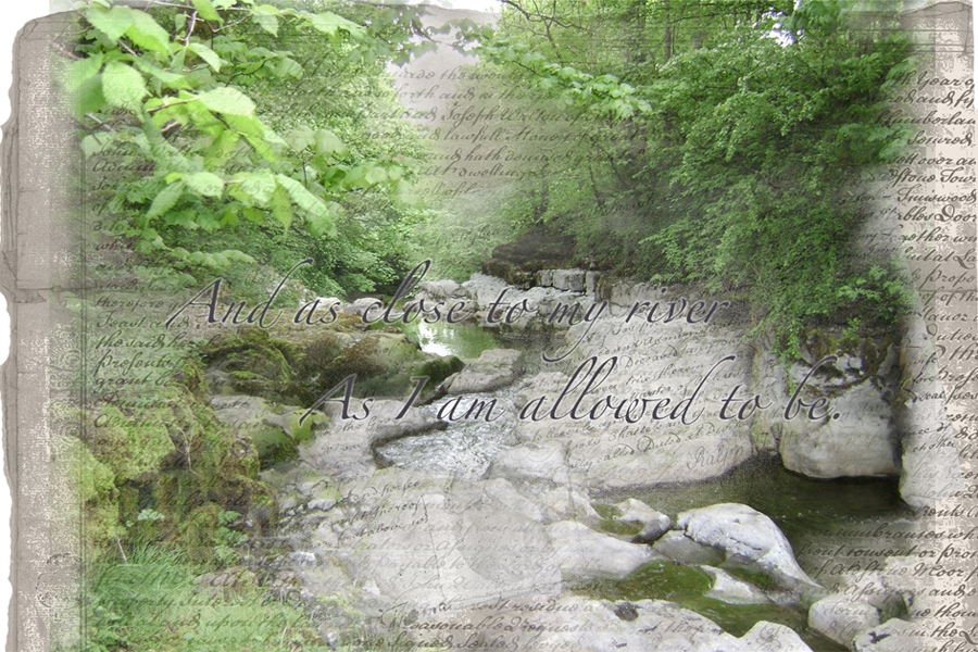
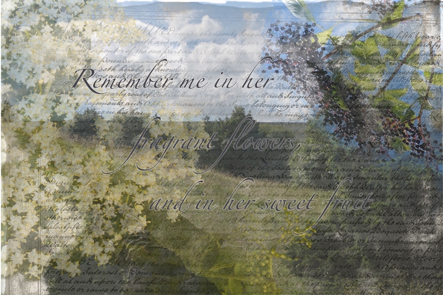
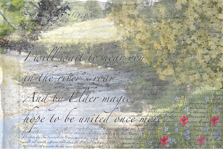
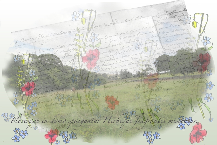
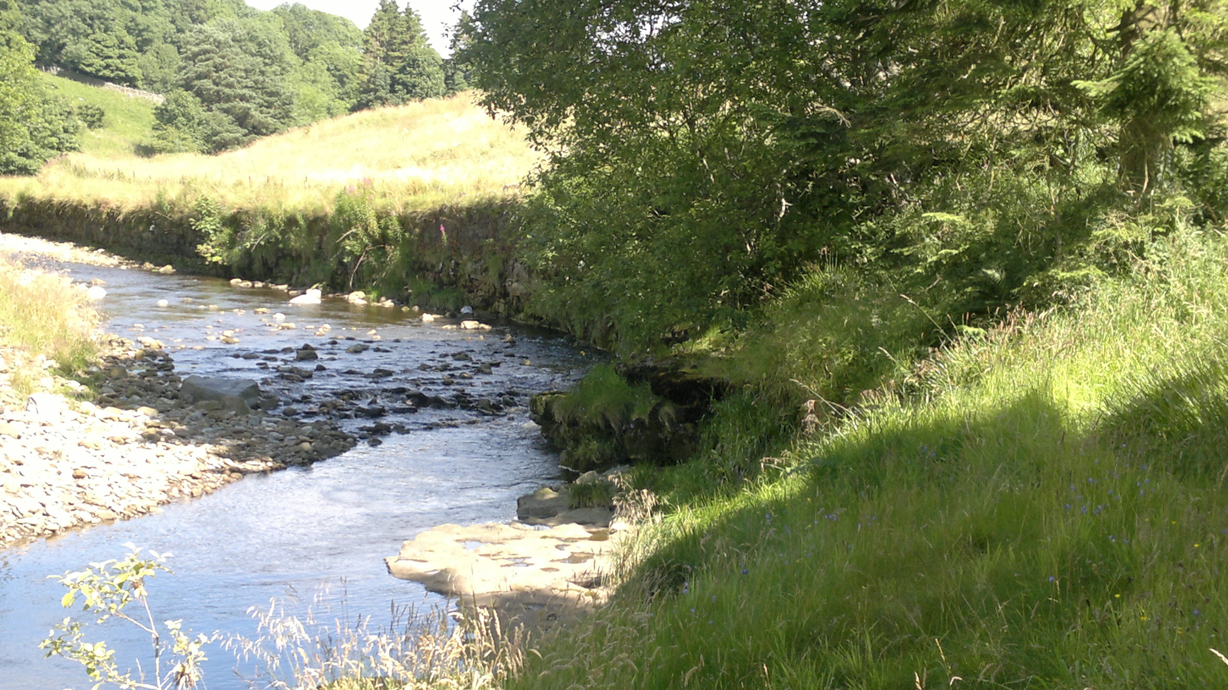
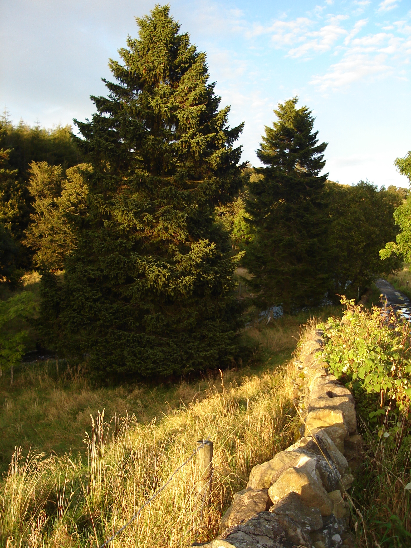
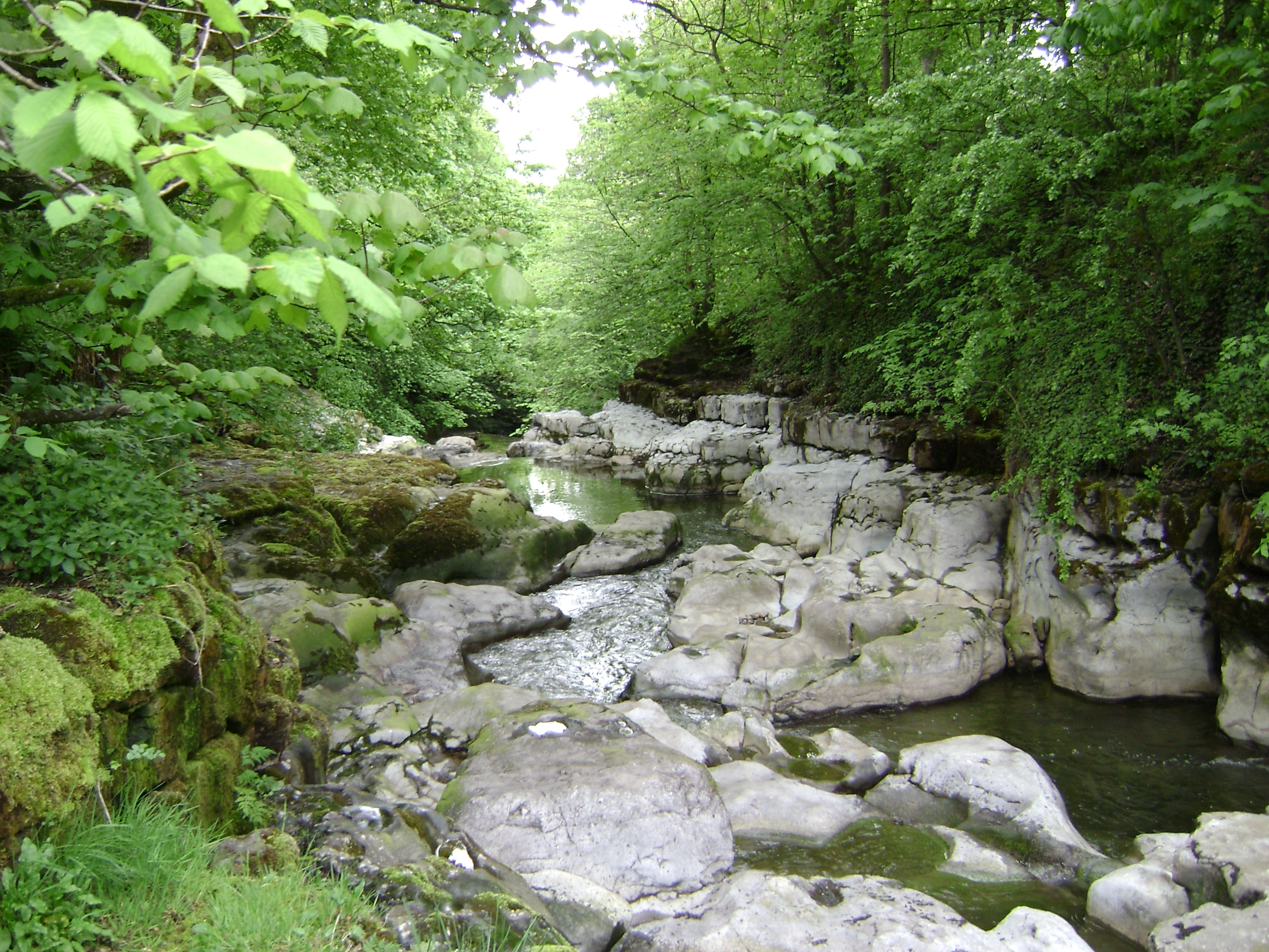
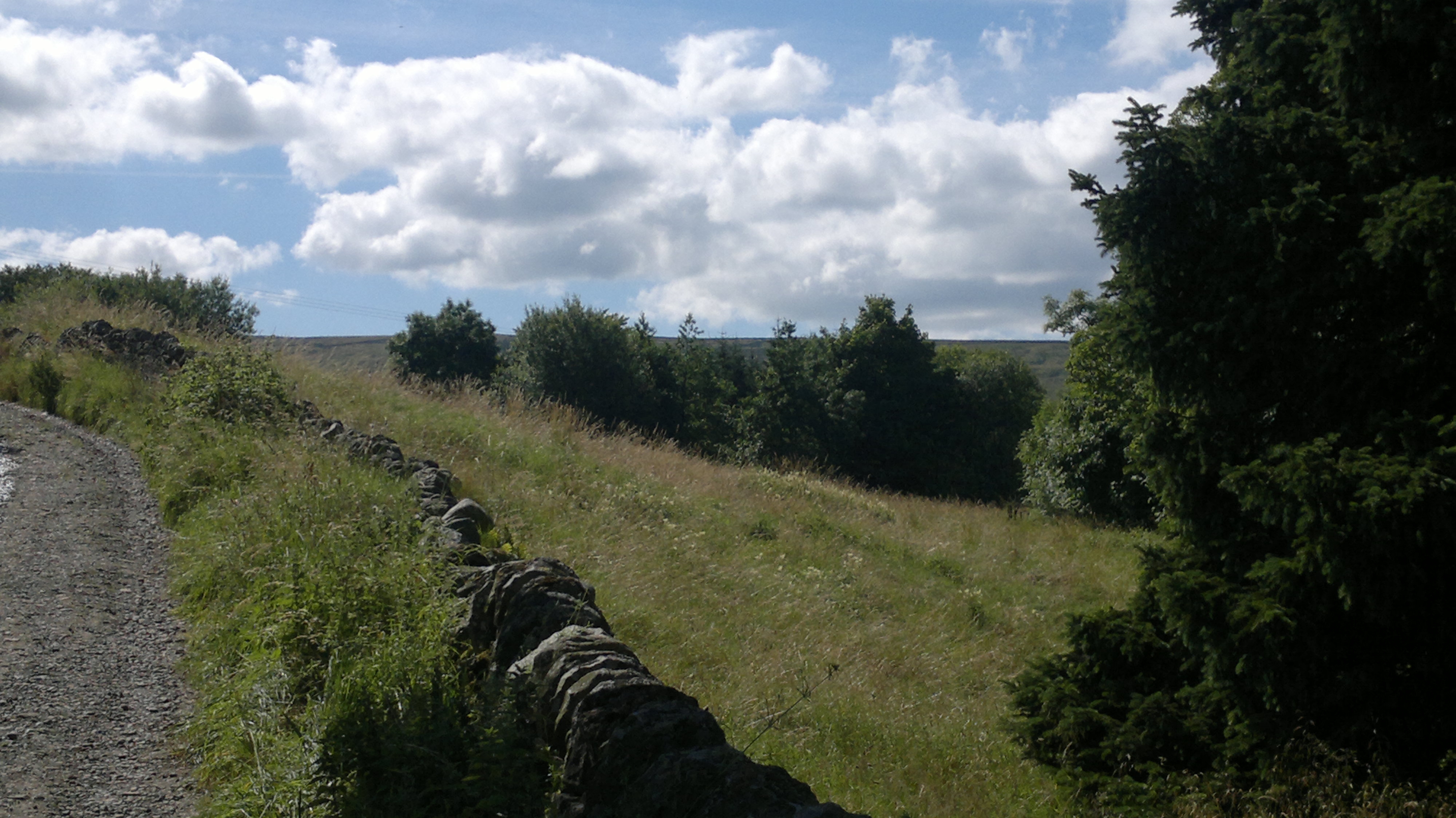
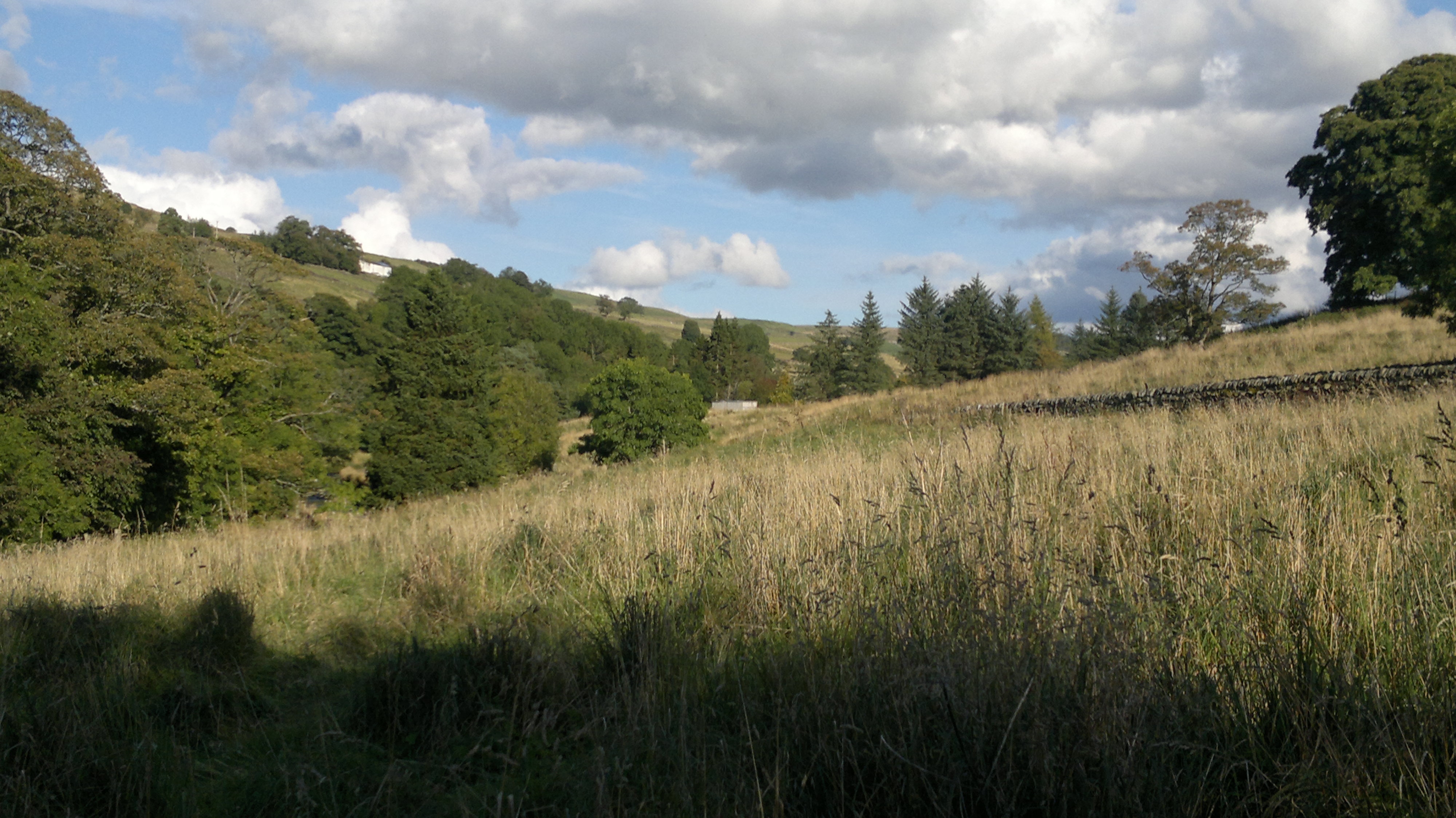
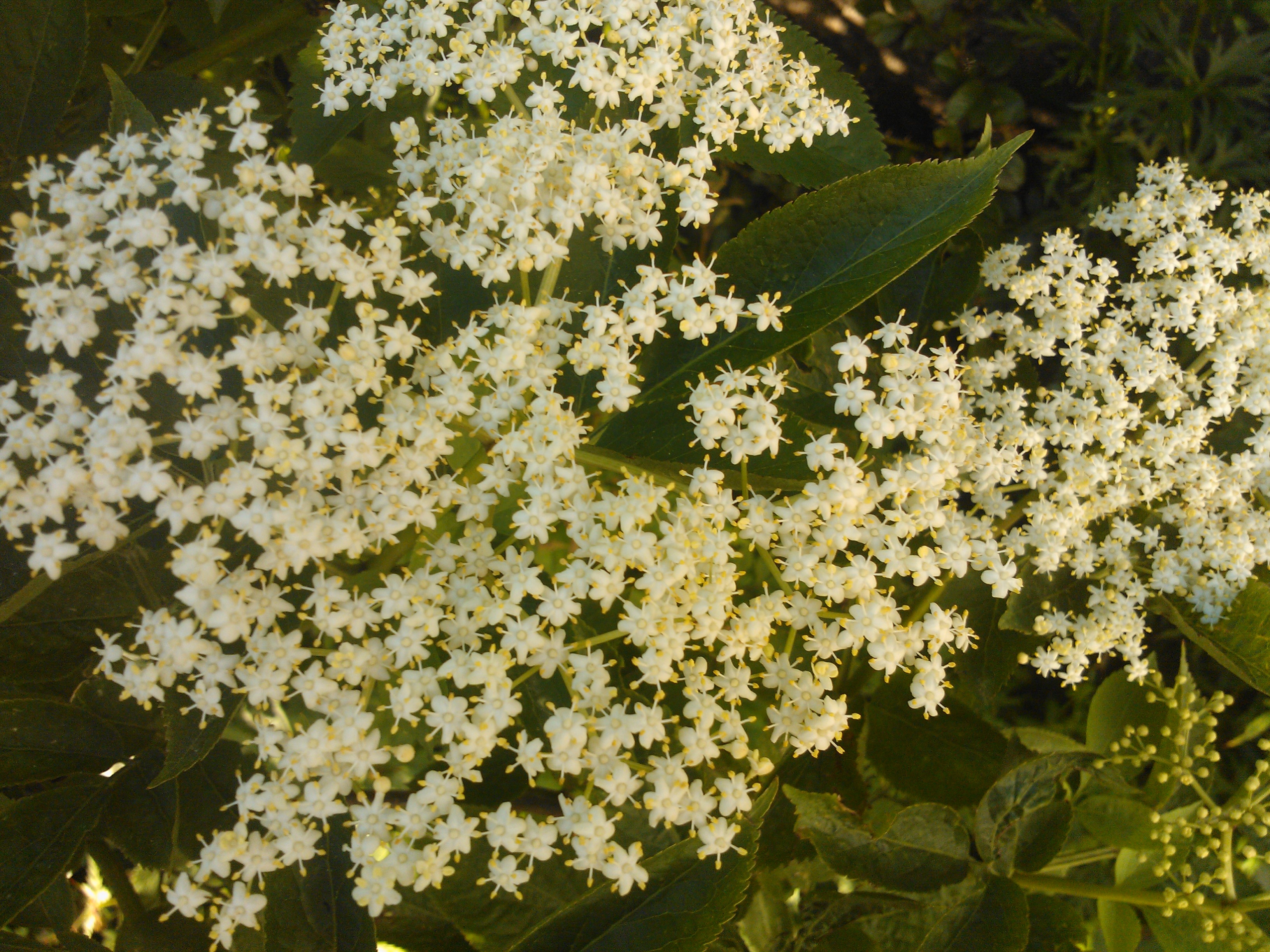
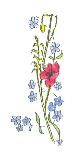
These pictures reference the themes I am including in my book. They include pictures of the landscape at mine, elders that I have grown, and a beautiful picture my husband took of the outflow of the waterfall at the bottom of our property, where it flows over the limestone. It is his favourite place. Also here is the illustration my Dad made to illustrate the poppies and blue flowers prose poem he wrote. My intention is to manipulate these images – going back to the palimpsest idea from early research to combine them with layers of text from my poem, the deed prints and text that my husband used in our orders of service when we got married – a medieval courtly love poem called The Iam Dulcis.
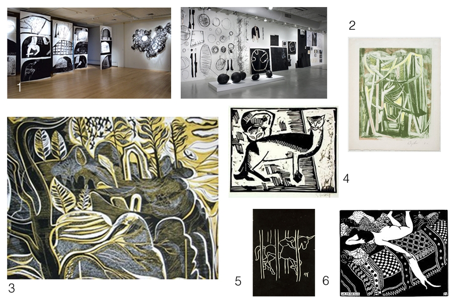
Hands tired, fingers sore from cutting collagraphs …. I venture onto moodle to read the Print Workshop ‘handout’. It includes many interesting examples from across a wide range of artists using various print making techniques. Here are the ones that catch my eye. I’m not always entirely sure why they do but, I know that I need to be more self-aware like that and more importantly, be able to talk/write about those responses – so that is what I am going to try to do.
1. Fraser Taylor. 2. Bryan Wynter. 3. Charles Shearer. 4.Schmidt-Rotluff. 5. Adrien Wiszniewski. 6. Felix Vallaton.
The Taylor examples (monoprint and mixed media sculpture) interest me because of their scale and the visual impact of the black and white. In ‘Intimacy’ – body forms and experiences of space and place seem to be evoked and I like the way these are echoed in the forms that occur in ‘Materiality’ that engage us with sensations about things in the material world – a sort of separateness between self and world, but also the connectivity that comes from sensing the world subjectively.
Wynter‘s example challenges me to consider the making process – over laying colours in monotype and the rhythmic mark making – drawing us down the ‘Path Through (the) Wood’
4, 5, and 6 are reminiscient (because of the contrasting b&w) of the scraper board work I used to enjoy doing so much at school! It is challenging to think of whole pictures in counterpoint … imagining when you carve, cut or scrape, the effect it will have in the positive image you finally produce. This has been very much at the fore-front of my visual thinking while cutting the collagraph boards for my portraits.
The Hawkstone Park website says ‘… there’s a magical world to discover’ when you visit and explore the site. There are grottoes and gothic arches among the follies in the landscape and I think the Shearer collagraph speaks of this ‘magical’ world. I love the fluidity of the mark making (and as I have learned …. curves are quite difficult to control on collagraph plates!), also the balance between the foreground (dark/cut-away) and the background (light/more intact board). I am really intrigued by the colouring and layering of this example in the handout…. I wonder, having studied it carefully, whether it isn’t actually the plate rather than a print from it. (?????????)
Beyond the above examples that ‘caught my eye’ there are my favourites… they are these.
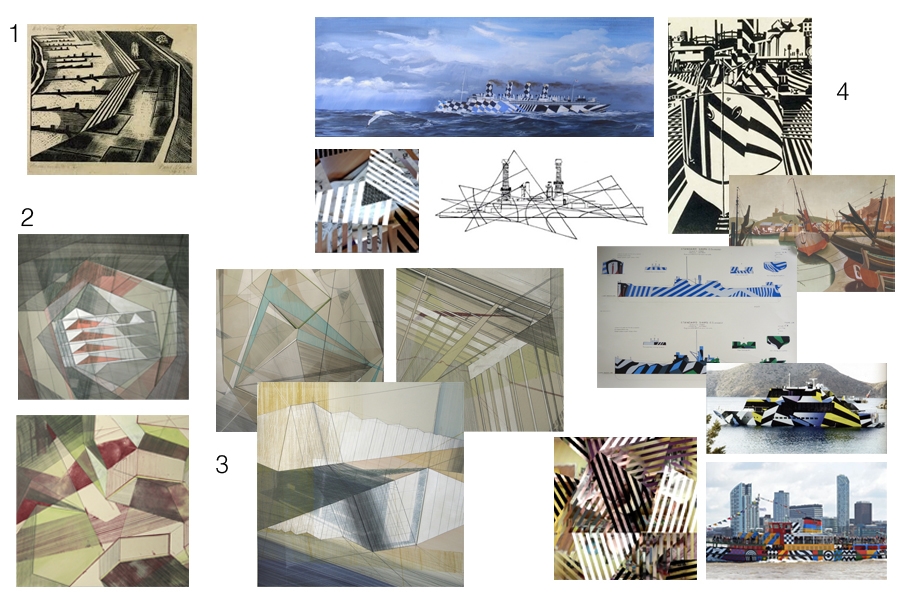
1. Nash. 2. Bronwen Sleigh. 3. More Sleigh. 4. A collection of connections in my mind.
First was the Nash example in the handout simply because I am quite familiar with his work having studied war art fairly extensively for putting together schemes of work when I was teaching. Looking through the handout though, it was the two works by Bronwen Sleigh that I felt drawn to, so much so, that I extended my research and looked her up on the internet. From this further exploration I found other works (3) that really fascinated me. I love the architectural/engineering drawing feel that they have. While I was looking at them, a sense of something familiar began hovering in the back of my mind – possibly triggered by the Nash associations conceptually(?) and I began to make some visual associations (4) with the Wilkinson/Wadsworth– War art & Vorticism unit of work I wrote when I was teaching. Perhaps the images the pupils made when they used the IWM razzle app to dazzle their own photos was the visual link in my mind?