Walking Around.

Walking around seems a good way to re-cap the first Semester of my M.A. in Contemporary Fine Art. Perhaps ‘wandering’ would be better, inflected with a sense of aimlessness and or being lost. I will stick with walking around for now and try and elicit something more purposeful and well-oriented by way of a reflective device.

The semester began with a cultural walk around Carlisle.

Enjoying the visual elements. Urban materiality. Sun and shadow meeting textures and shapes.
The hesitant presence of the tentative MACFA student.
Enjoying the visual elements. Contrasting materialism. Animal, vegetable, mineral, natural and man-made. Growth and decay.

Later came an art walk around Glasgow.

Highlights: Beast, Sleigh and Boyce.

For some reason the visual responses, investigations and outcomes that these experiences were generating just did NOT – neither by wish, nor hope, nor prayer – seem to aid in articulating the work I had proposed at the start of the semester – very frustrating.

The Road Not Taken (a detour)

1. 2/3 4/5 6

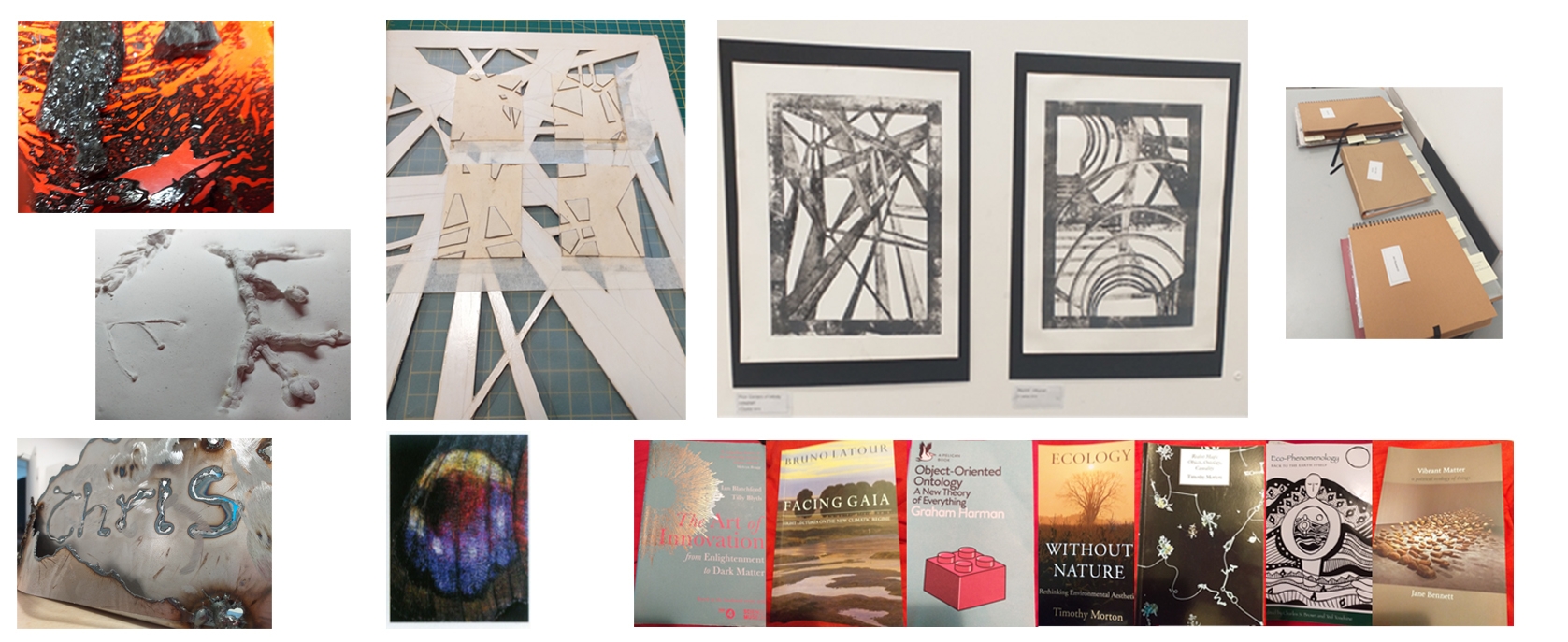
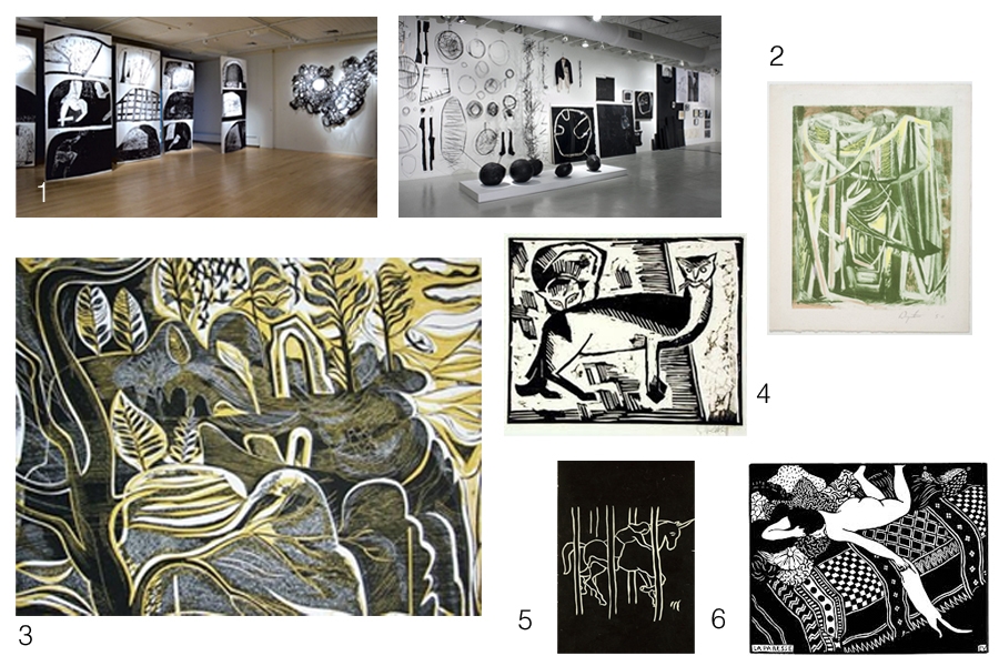
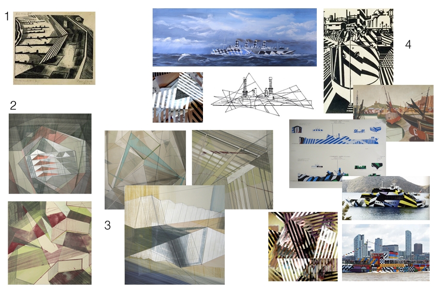
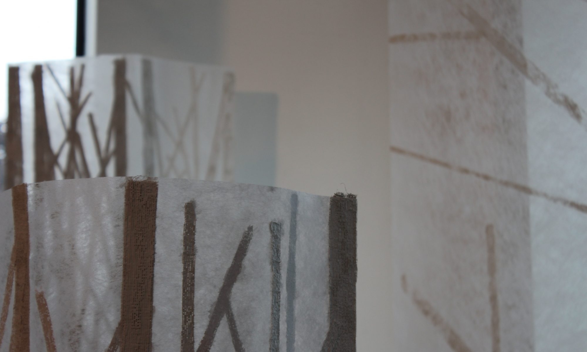
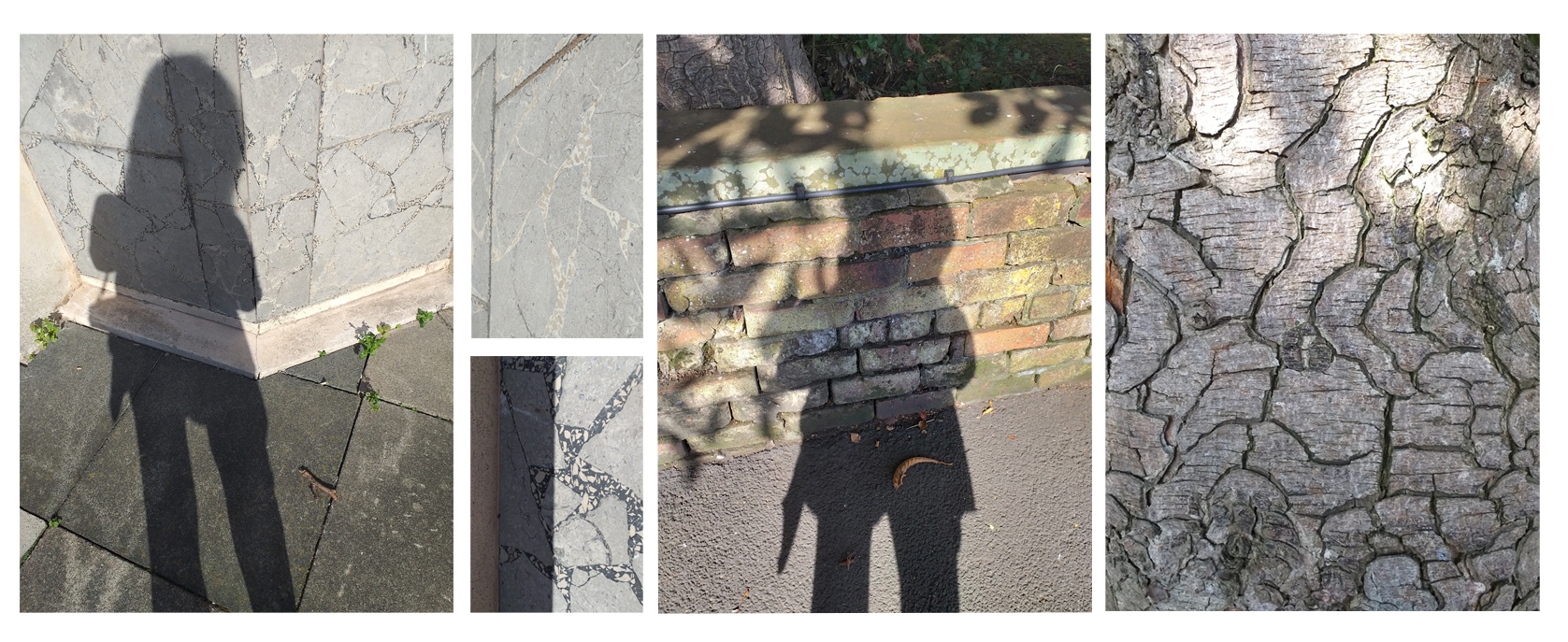
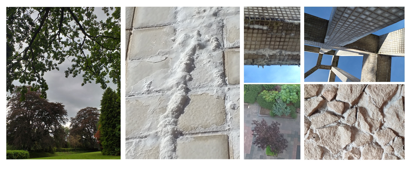
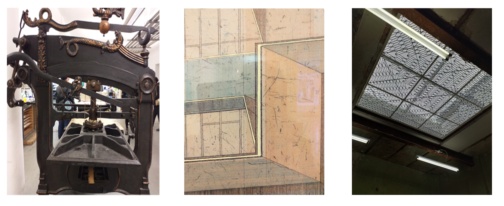
In the beginning, I was quite engaged with exploring some new materials, media and processes. (1.left top down) Tar, plaster, steel – all I think seated in the mentality of the ‘workshop induction phase’ of the course – inculcation into a new institution. But experimentation did not relate to my proposal questions – it stubbornly refused to go that way. I travelled down to Lancaster one Friday and enjoyed a spell in the Ruskin Library before attending a seminar by Franziska Schenk about irridescence (3) and mingling with tea and biscuits afterwards, I actually met Sarah Casey. Driving home, I felt quite despondent – the contrasting emotion of how enervating and exciting the day had been, pitted against frustration with my practice. I decided to depart from my proposal to follow a different path and indulge in a little print project (2 &4 )based upon the superstructure of the Civic Centre in Rickergate and taking a little inspiration from Bronwen Sleigh’s work at Glasgow Print Studio. Reflecting upon things, I was coming to realise what a huge ask it is to expect yourself to start a new course, orientate yourself in a new institution – different people, places and procedures- my art journal and sketchbook(5) were demonstrating this , filling up rapidly with nothing useful while also expecting yourself to advance your practice in a coherent way. It was enjoyable to work in the print studio doing a low-tech project but the reading was what was really capturing my enthusiasm … and what a lot of it there was! (6)

‘What You Have To Do’ 2. contd…. again.

Hands tired, fingers sore from cutting collagraphs …. I venture onto moodle to read the Print Workshop ‘handout’. It includes many interesting examples from across a wide range of artists using various print making techniques. Here are the ones that catch my eye. I’m not always entirely sure why they do but, I know that I need to be more self-aware like that and more importantly, be able to talk/write about those responses – so that is what I am going to try to do.

1. Fraser Taylor. 2. Bryan Wynter. 3. Charles Shearer. 4.Schmidt-Rotluff. 5. Adrien Wiszniewski. 6. Felix Vallaton.

The Taylor examples (monoprint and mixed media sculpture) interest me because of their scale and the visual impact of the black and white. In ‘Intimacy’ – body forms and experiences of space and place seem to be evoked and I like the way these are echoed in the forms that occur in ‘Materiality’ that engage us with sensations about things in the material world – a sort of separateness between self and world, but also the connectivity that comes from sensing the world subjectively.

Wynter‘s example challenges me to consider the making process – over laying colours in monotype and the rhythmic mark making – drawing us down the ‘Path Through (the) Wood’

4, 5, and 6 are reminiscient (because of the contrasting b&w) of the scraper board work I used to enjoy doing so much at school! It is challenging to think of whole pictures in counterpoint … imagining when you carve, cut or scrape, the effect it will have in the positive image you finally produce. This has been very much at the fore-front of my visual thinking while cutting the collagraph boards for my portraits.

The Hawkstone Park website says ‘… there’s a magical world to discover’ when you visit and explore the site. There are grottoes and gothic arches among the follies in the landscape and I think the Shearer collagraph speaks of this ‘magical’ world. I love the fluidity of the mark making (and as I have learned …. curves are quite difficult to control on collagraph plates!), also the balance between the foreground (dark/cut-away) and the background (light/more intact board). I am really intrigued by the colouring and layering of this example in the handout…. I wonder, having studied it carefully, whether it isn’t actually the plate rather than a print from it. (?????????)

Beyond the above examples that ‘caught my eye’ there are my favourites… they are these.

1. Nash. 2. Bronwen Sleigh. 3. More Sleigh. 4. A collection of connections in my mind.

First was the Nash example in the handout simply because I am quite familiar with his work having studied war art fairly extensively for putting together schemes of work when I was teaching. Looking through the handout though, it was the two works by Bronwen Sleigh that I felt drawn to, so much so, that I extended my research and looked her up on the internet. From this further exploration I found other works (3) that really fascinated me. I love the architectural/engineering drawing feel that they have. While I was looking at them, a sense of something familiar began hovering in the back of my mind – possibly triggered by the Nash associations conceptually(?) and I began to make some visual associations (4) with the Wilkinson/Wadsworth– War art & Vorticism unit of work I wrote when I was teaching. Perhaps the images the pupils made when they used the IWM razzle app to dazzle their own photos was the visual link in my mind?