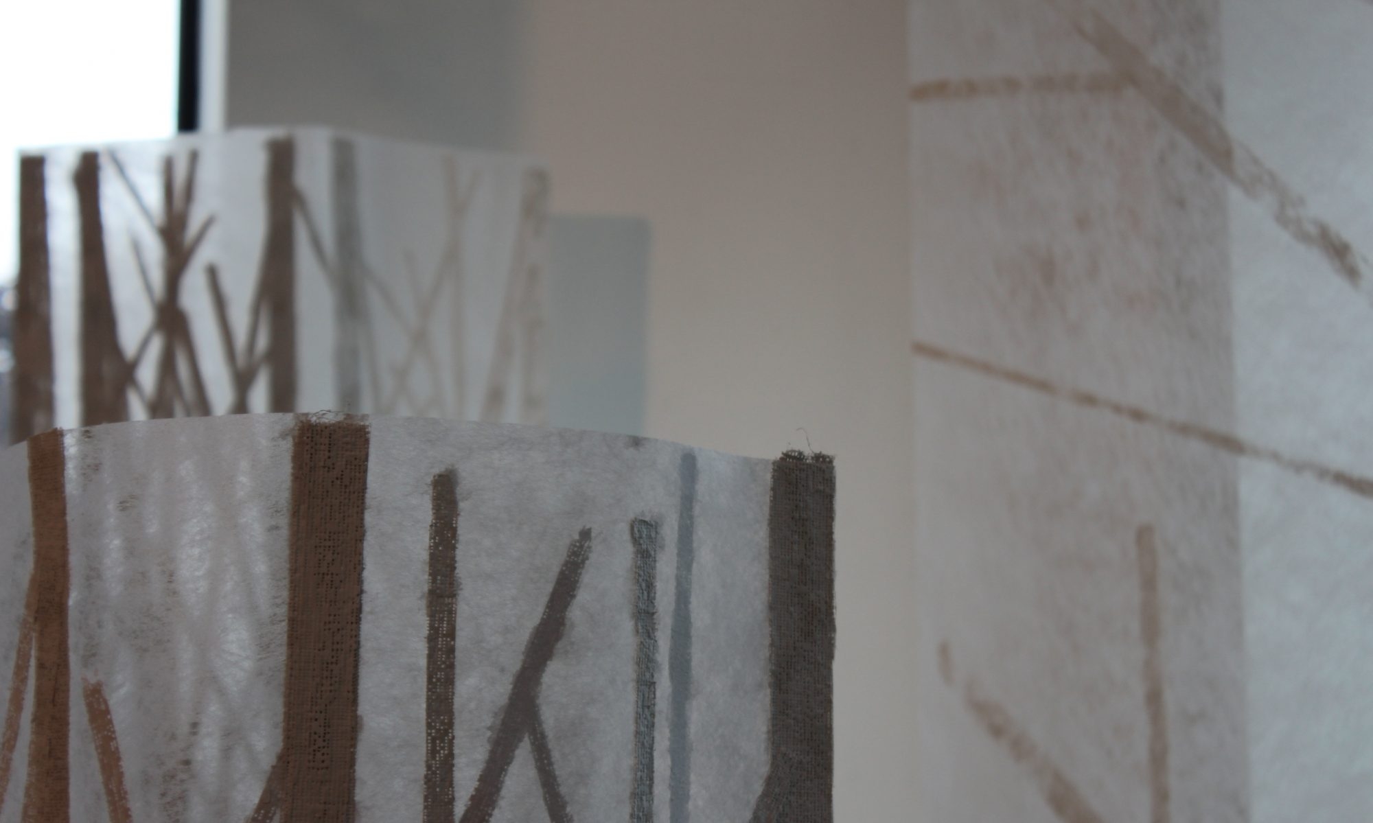
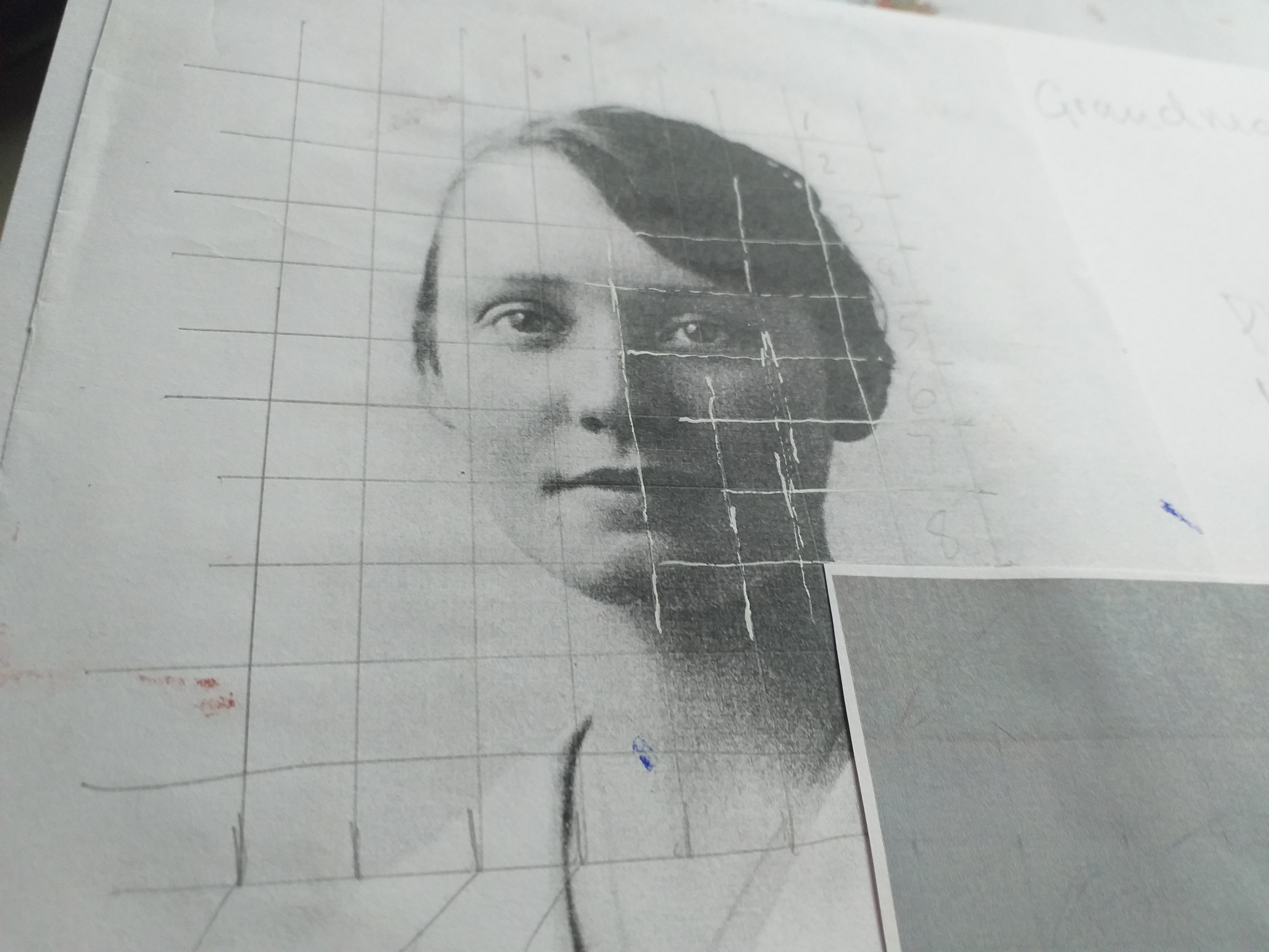
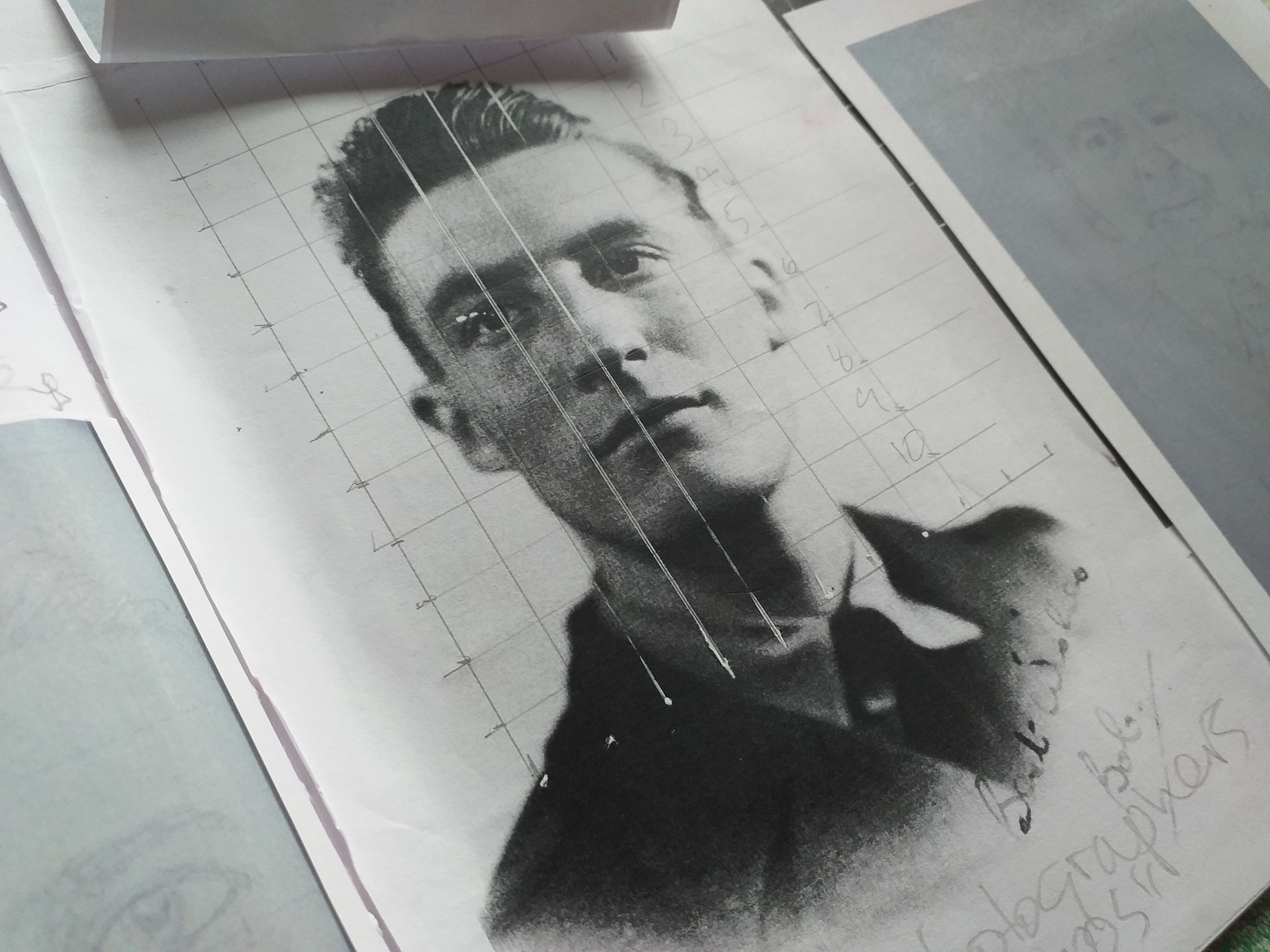
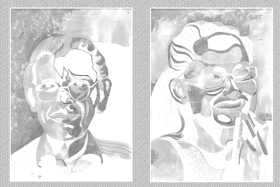
Hands tired, fingers sore from cutting collagraphs …. I venture onto moodle to read the Print Workshop ‘handout’. It includes many interesting examples from across a wide range of artists using various print making techniques. Here are the ones that catch my eye. I’m not always entirely sure why they do but, I know that I need to be more self-aware like that and more importantly, be able to talk/write about those responses – so that is what I am going to try to do.
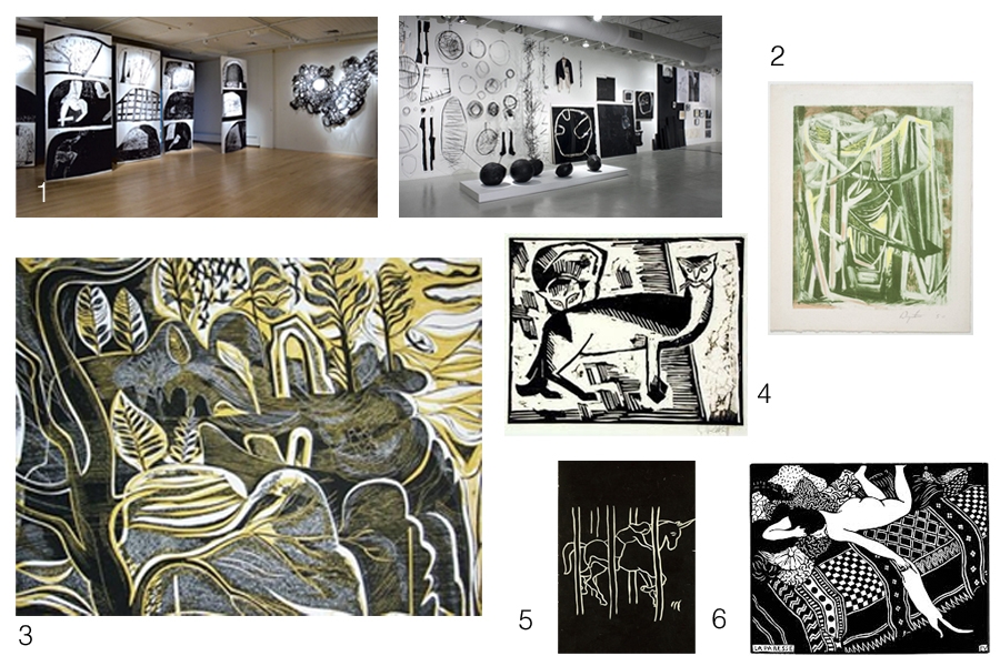
The Taylor examples (monoprint and mixed media sculpture) interest me because of their scale and the visual impact of the black and white. In ‘Intimacy’ – body forms and experiences of space and place seem to be evoked and I like the way these are echoed in the forms that occur in ‘Materiality’ that engage us with sensations about things in the material world – a sort of separateness between self and world, but also the connectivity that comes from sensing the world subjectively.
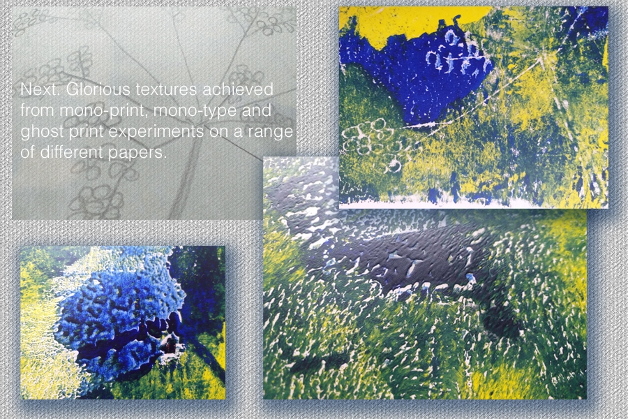
Wynter‘s example challenges me to consider the making process – over laying colours in monotype and the rhythmic mark making – drawing us down the ‘Path Through (the) Wood’
4, 5, and 6 are reminiscient (because of the contrasting b&w) of the scraper board work I used to enjoy doing so much at school! It is challenging to think of whole pictures in counterpoint … imagining when you carve, cut or scrape, the effect it will have in the positive image you finally produce. This has been very much at the fore-front of my visual thinking while cutting the collagraph boards for my portraits.
The Hawkstone Park website says ‘… there’s a magical world to discover’ when you visit and explore the site. There are grottoes and gothic arches among the follies in the landscape and I think the Shearer collagraph speaks of this ‘magical’ world. I love the fluidity of the mark making (and as I have learned …. curves are quite difficult to control on collagraph plates!), also the balance between the foreground (dark/cut-away) and the background (light/more intact board). I am really intrigued by the colouring and layering of this example in the handout…. I wonder, having studied it carefully, whether it isn’t actually the plate rather than a print from it. (?????????)
Beyond the above examples that ‘caught my eye’ there are my favourites… they are these.
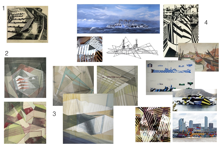
First was the Nash example in the handout simply because I am quite familiar with his work having studied war art fairly extensively for putting together schemes of work when I was teaching. Looking through the handout though, it was the two works by Bronwen Sleigh that I felt drawn to, so much so, that I extended my research and looked her up on the internet. From this further exploration I found other works (3) that really fascinated me. I love the architectural/engineering drawing feel that they have. While I was looking at them, a sense of something familiar began hovering in the back of my mind – possibly triggered by the Nash associations conceptually(?) and I began to make some visual associations (4) with the Wilkinson/Wadsworth– War art & Vorticism unit of work I wrote when I was teaching. Perhaps the images the pupils made when they used the IWM razzle app to dazzle their own photos was the visual link in my mind?
