Putting it all together.
Ephemera and inclusions. Dad’s prose poem, wedding souvenirs, messages to loved ones, pressed blue flowers from Dad’s funeral…..
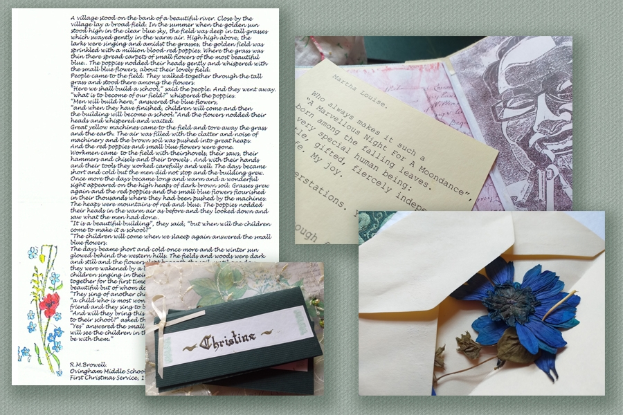
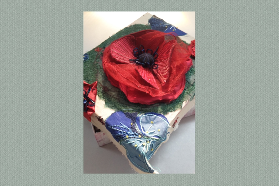
Making a Box and locking the treasures away.
Christine Lowthian
These are the practical activities….. my experiments, reflections and concept development throughout the project.
Putting it all together.
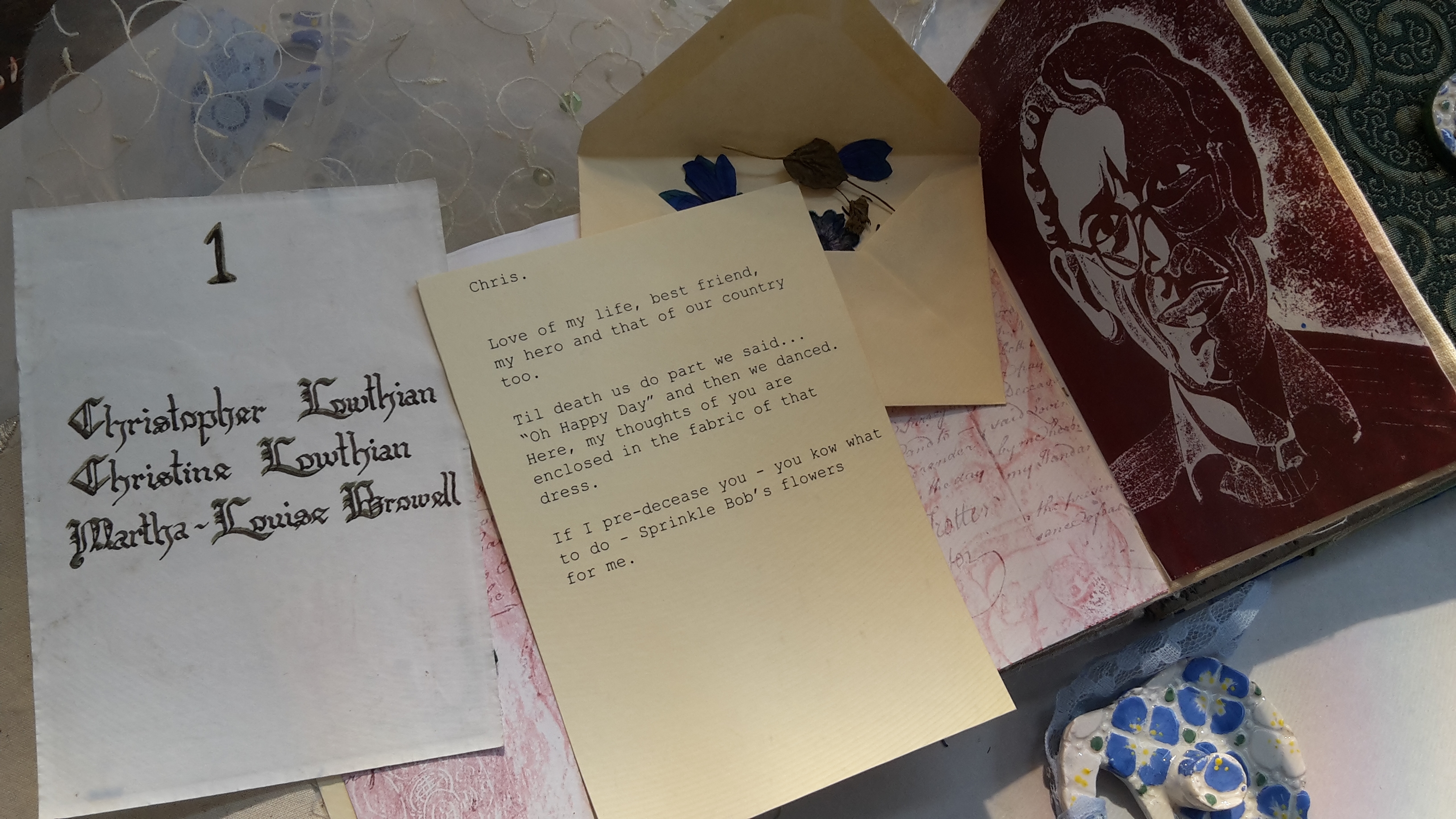
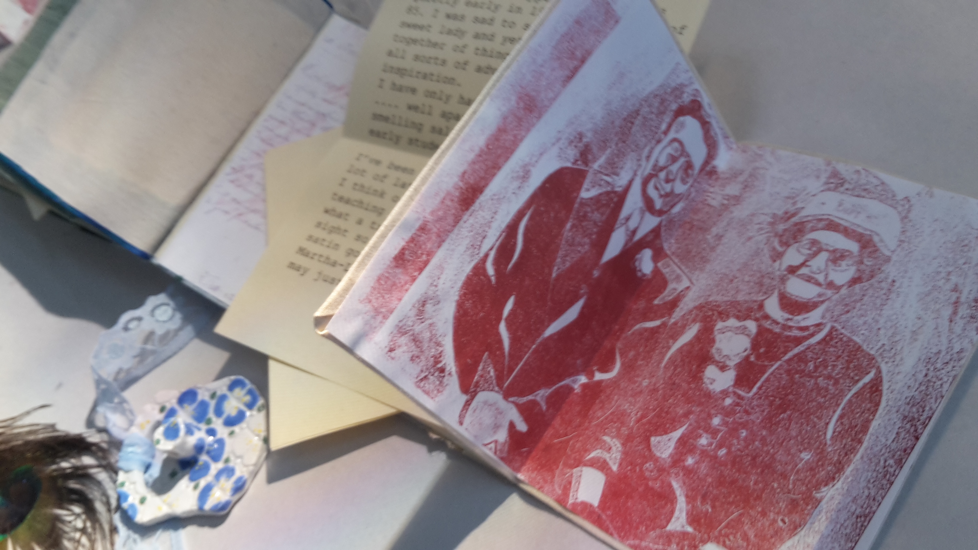
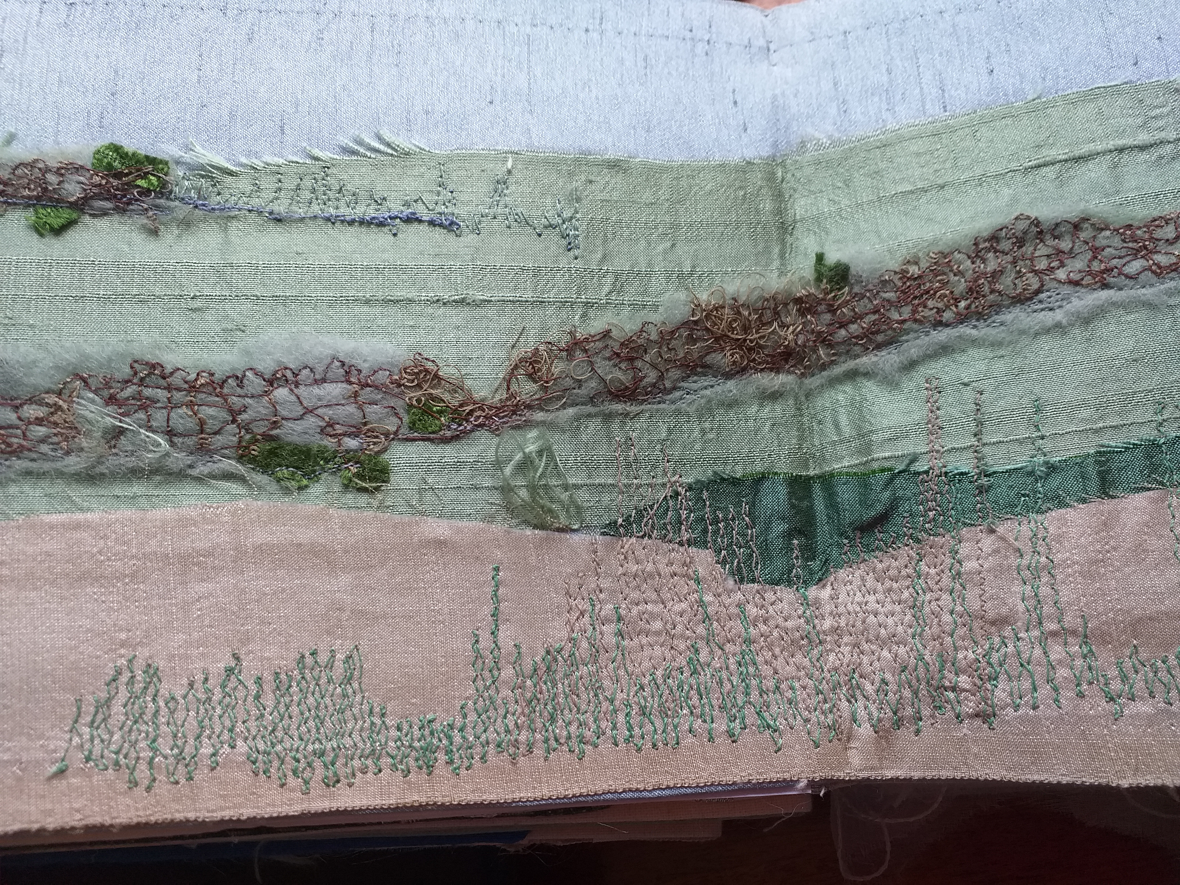
Ephemera and inclusions. Dad’s prose poem, wedding souvenirs, messages to loved ones, pressed blue flowers from Dad’s funeral…..

Making a Box and locking the treasures away.
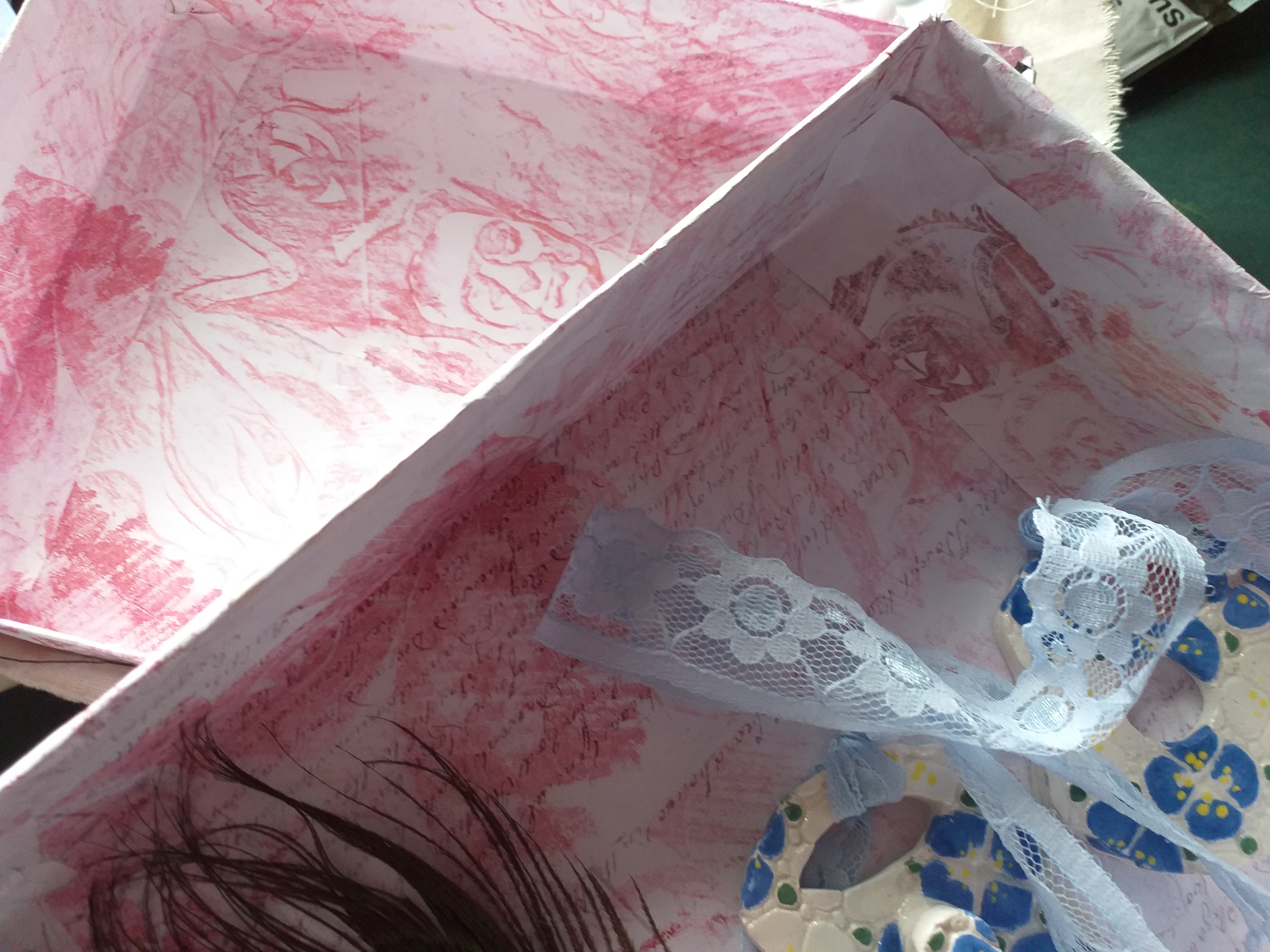
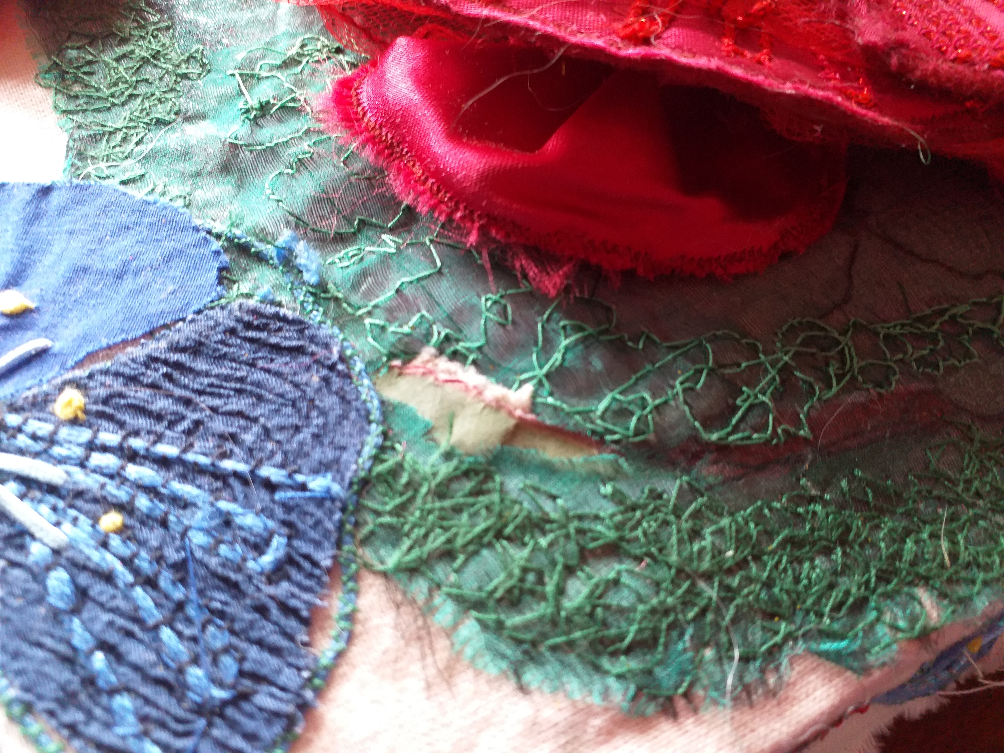
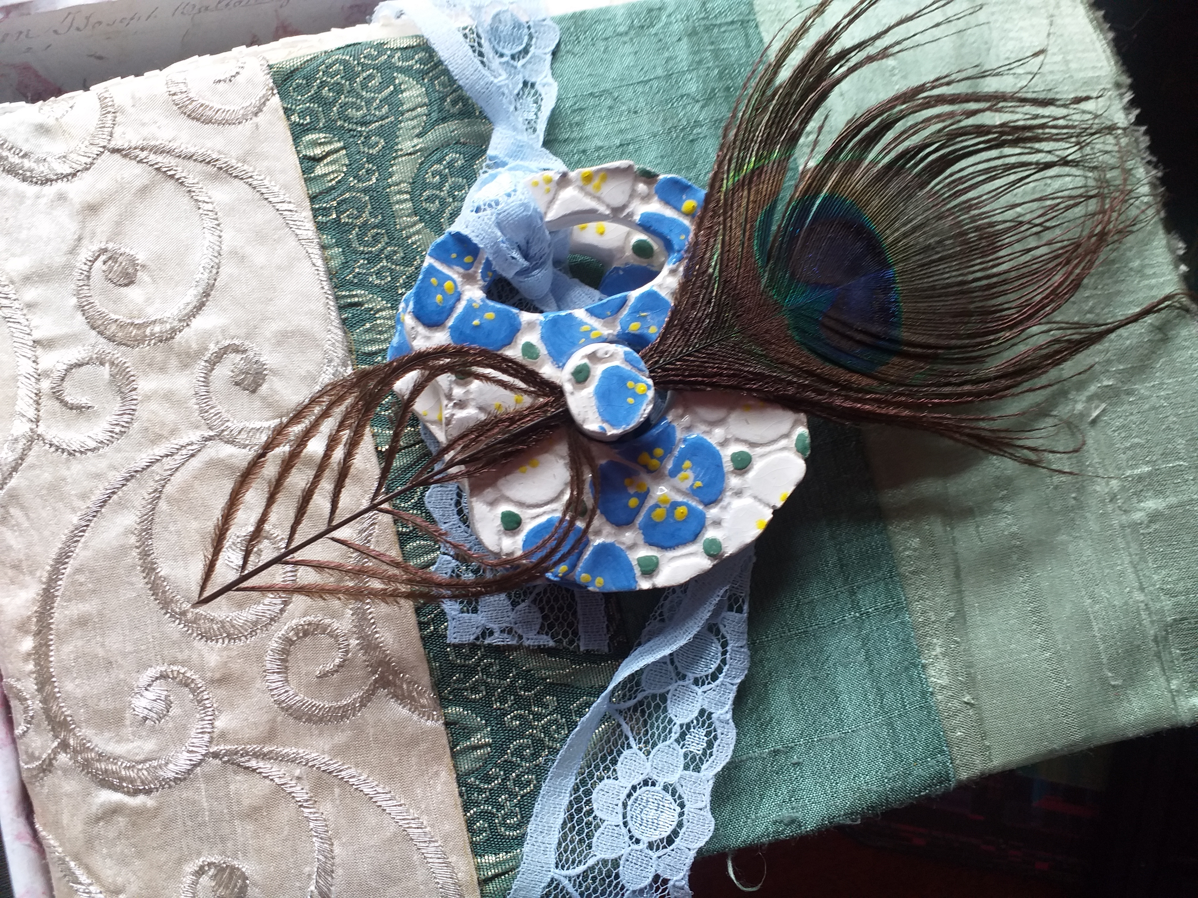

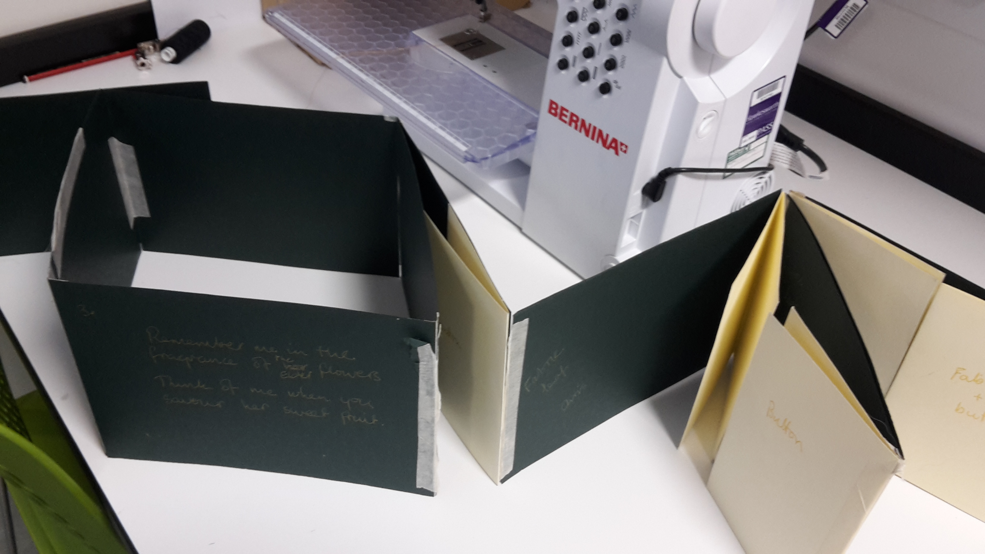
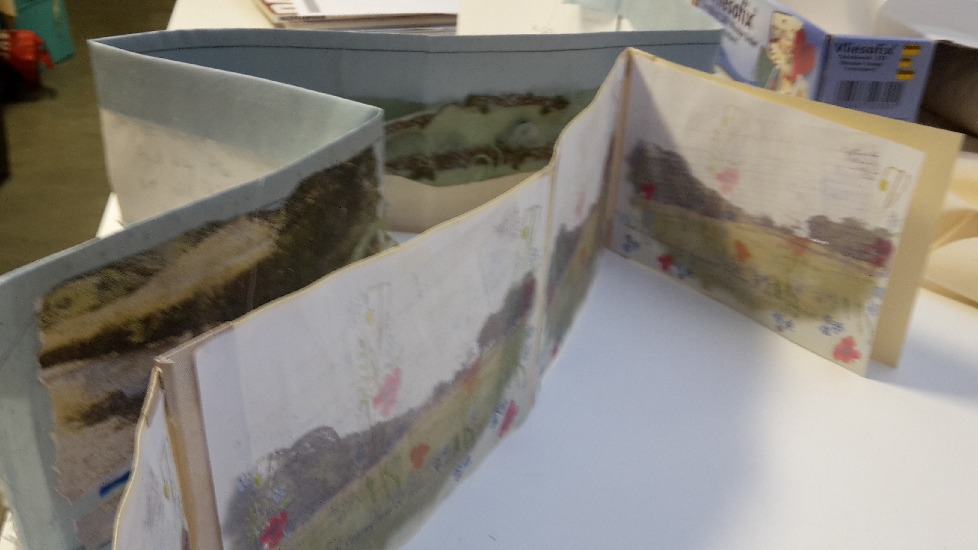
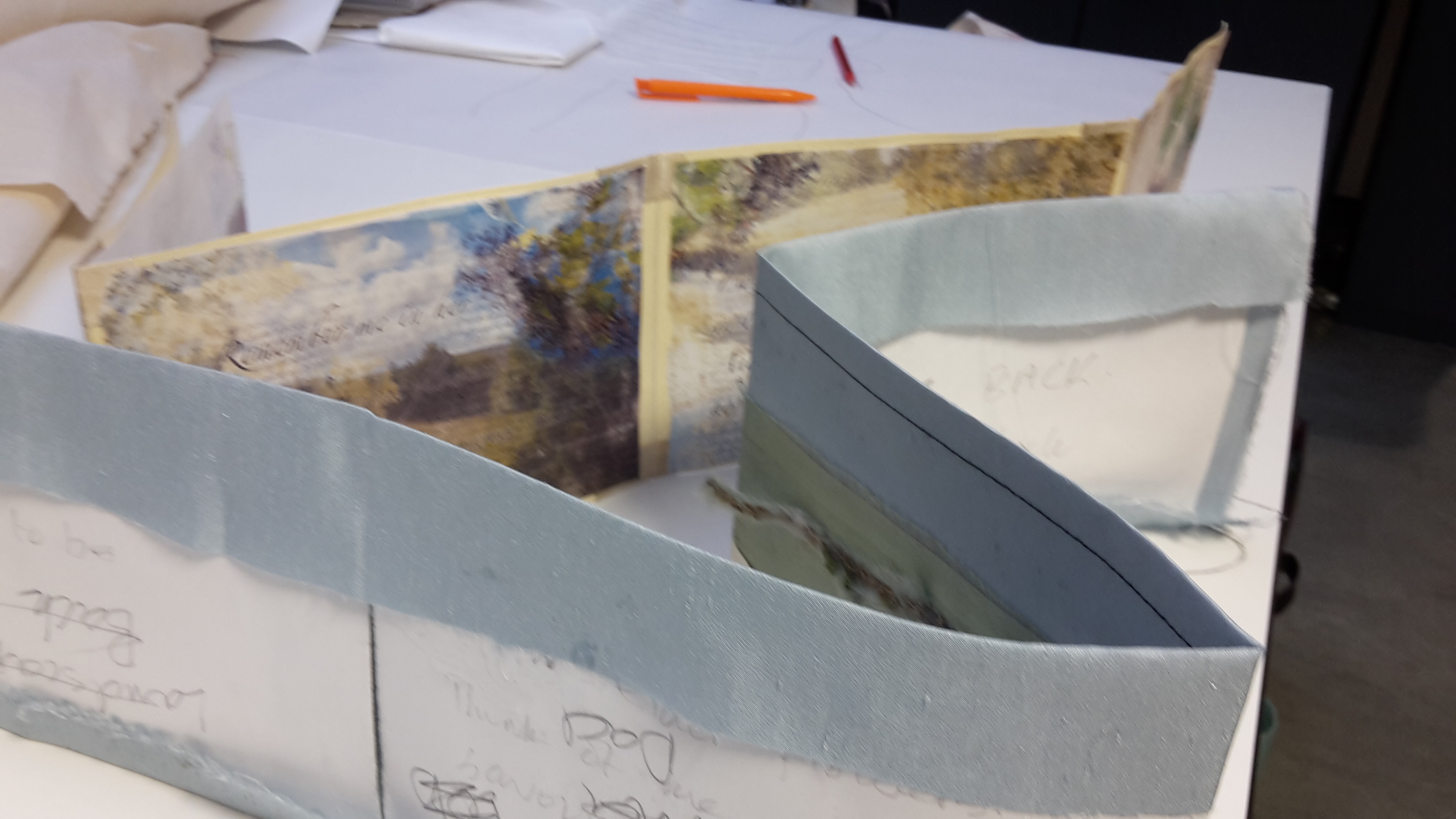
Last weekend, I made a mock-up for the book format I am going to use for the final ‘Scrap That’ artefact. I am basing my design on the gorgeous Watanabe book I discovered in my earlier research. In her case, she had used a folding box structure to represent rooms in a traditional Japanese house in which, the fusama open out as ‘pages’ bearing translations into modern Japanese of writings her father had made. I love the way the format facilitates the creation of sequences of pages (like a journey) and enclosed space (like a resting place). My intention is to build my book so that the ‘reading order’ is a journey along which I read my poem before meeting my loved ones and sharing thoughts with them before entering the final resting place by way of a walk through my home landscape and into the enclosed space of the book … the sort of flower strewn chamber of the Iam Dulcis. It is a very complicated structure.
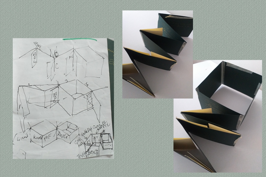
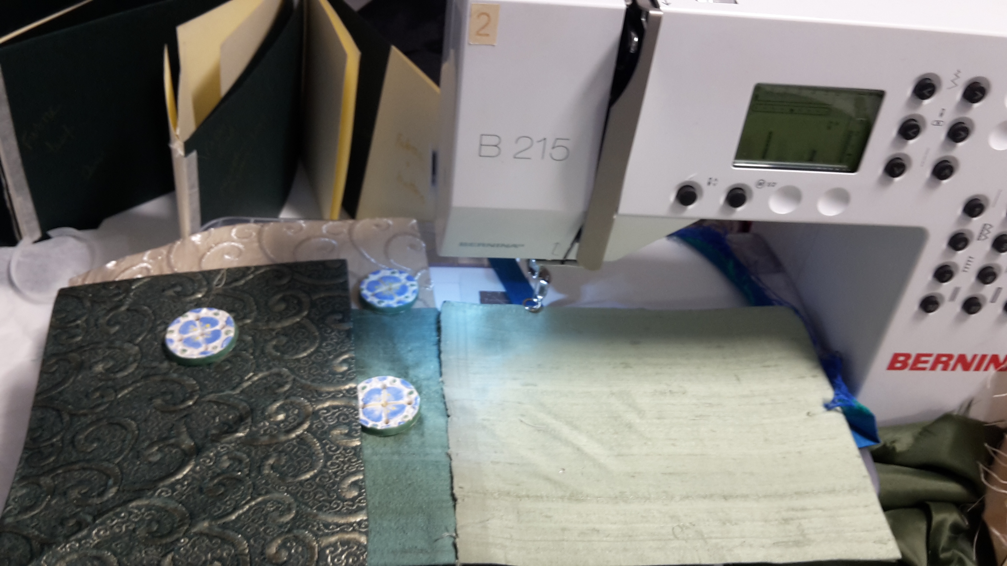
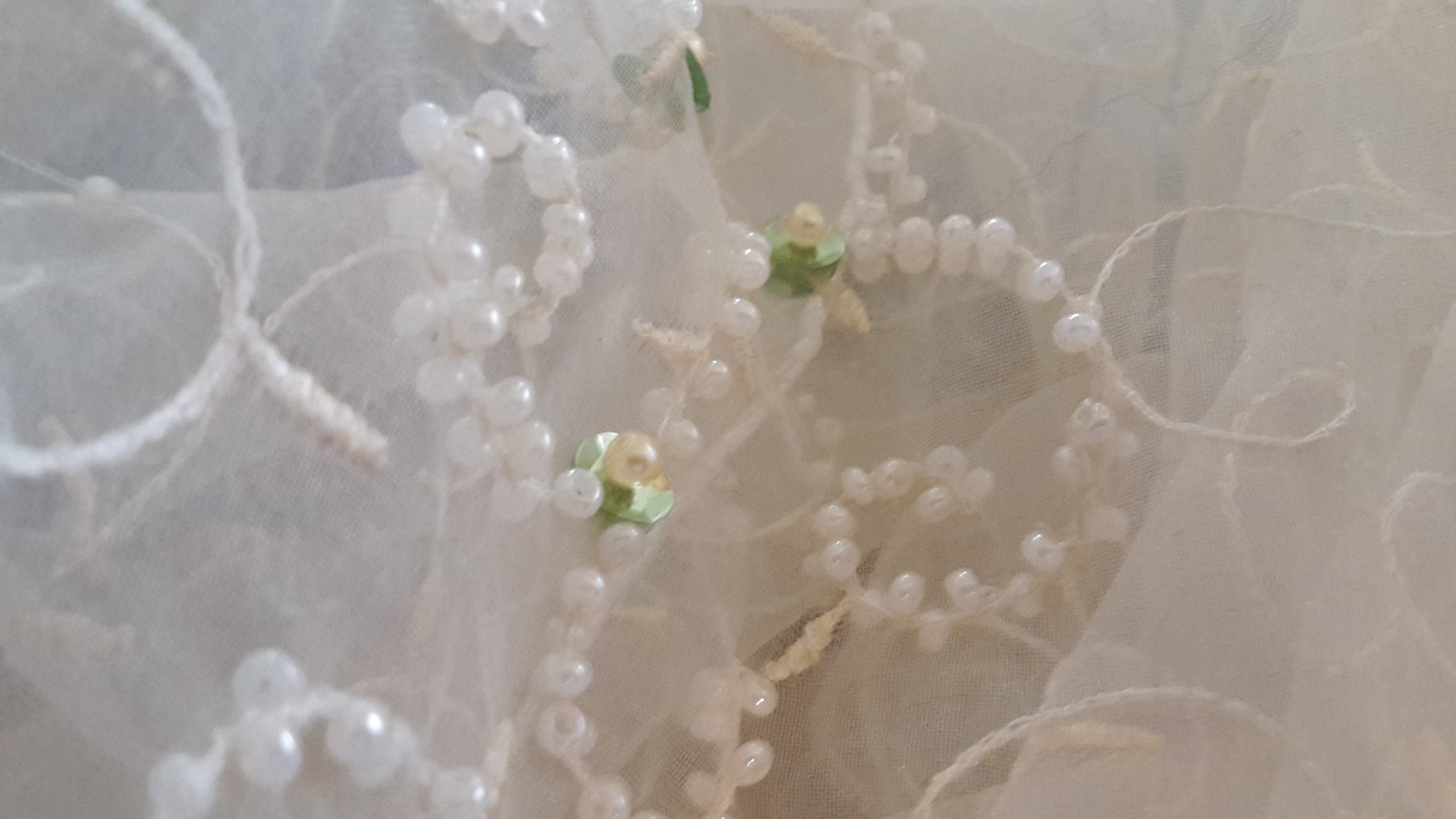
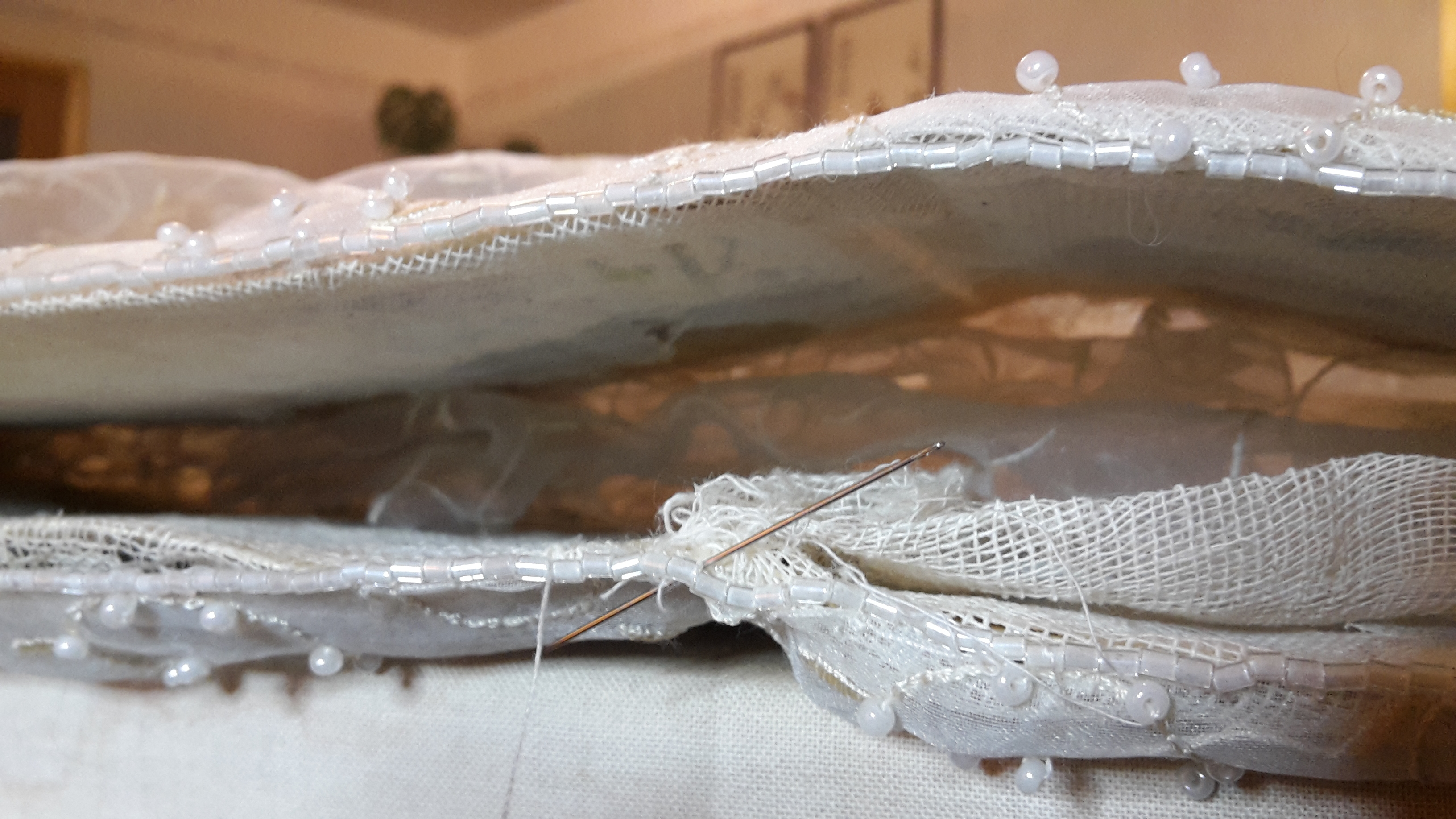
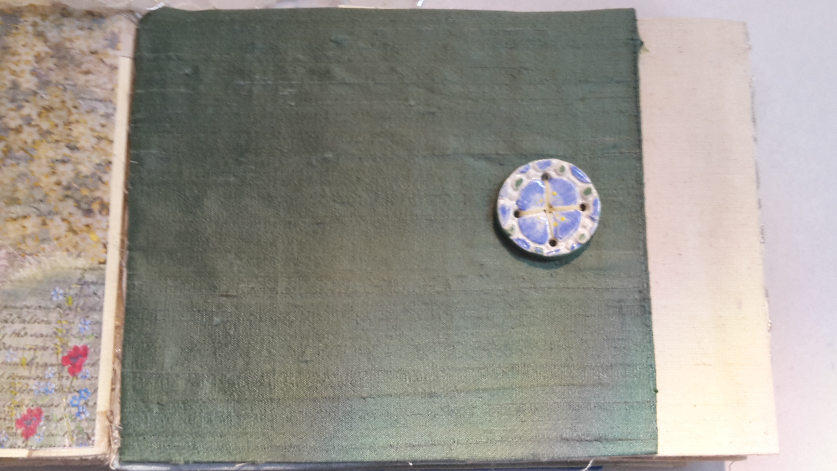
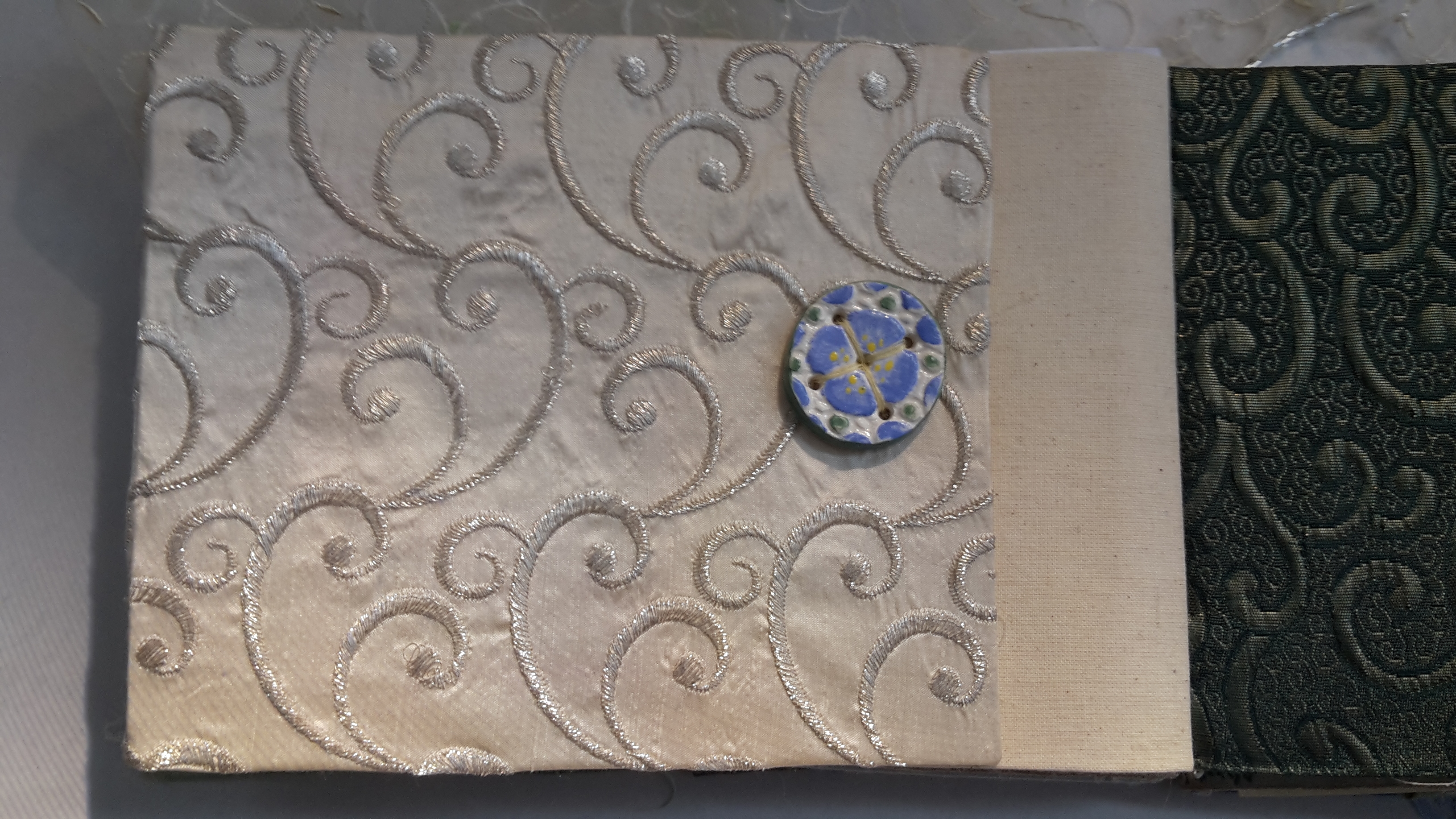
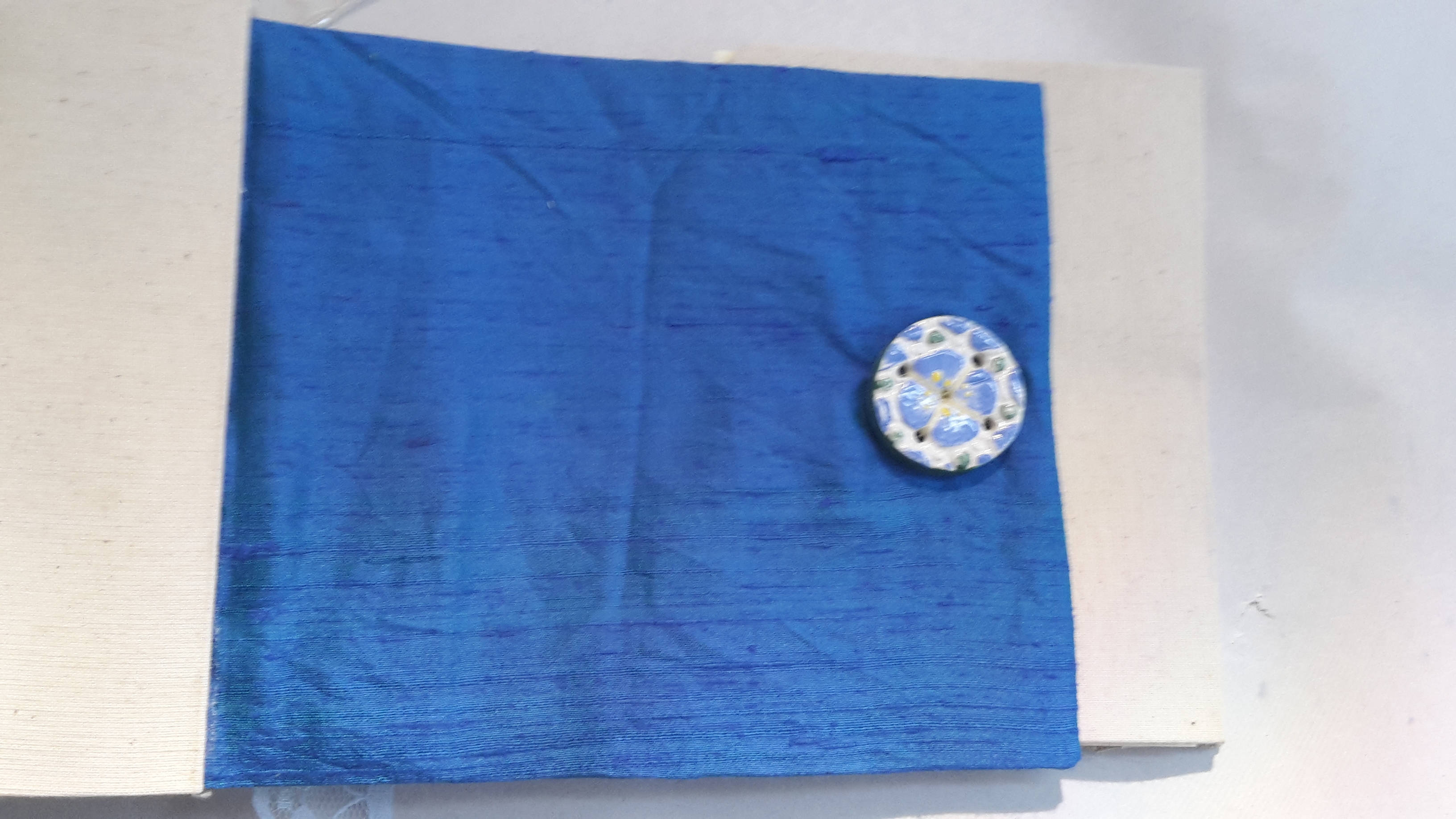
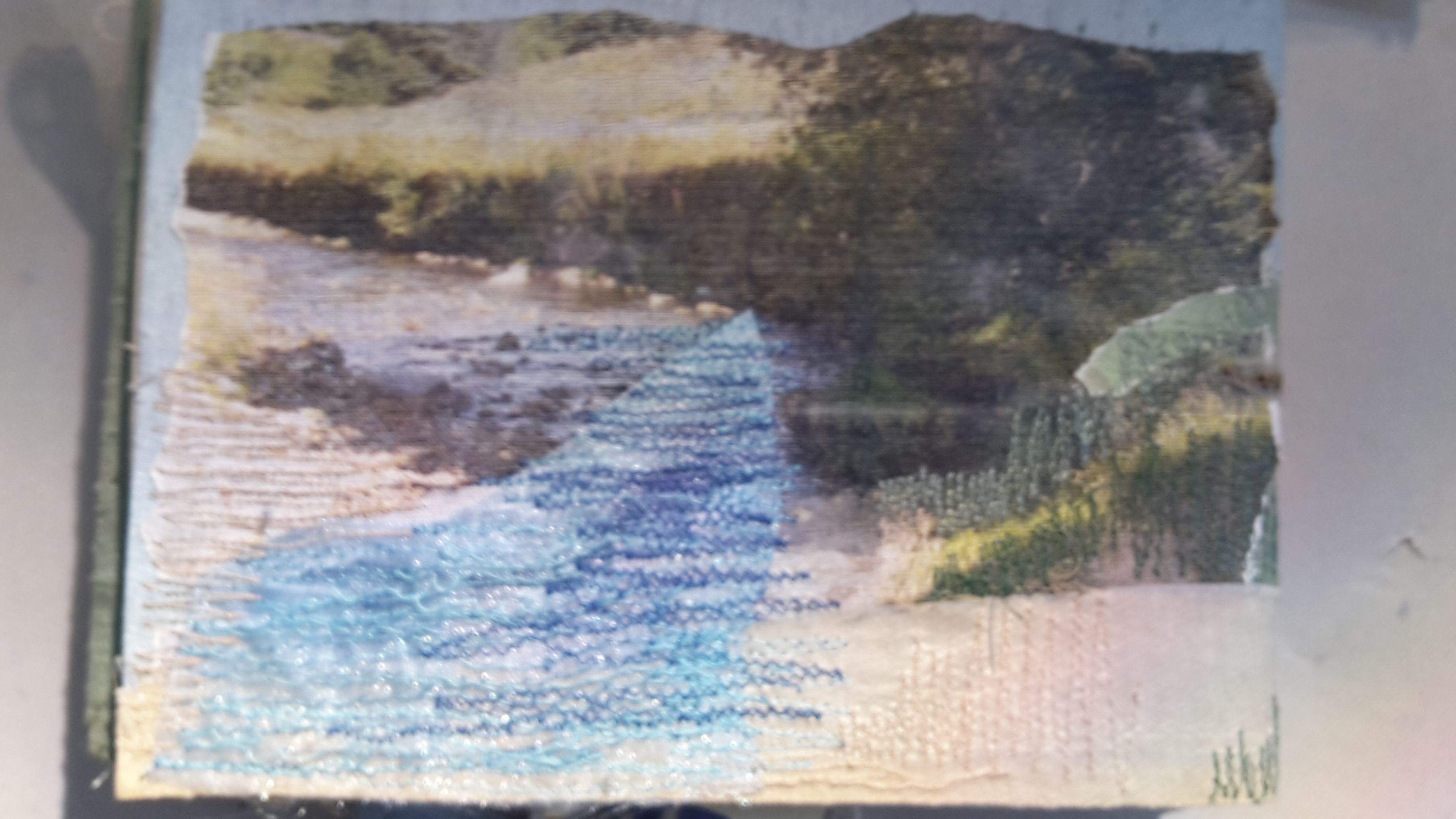
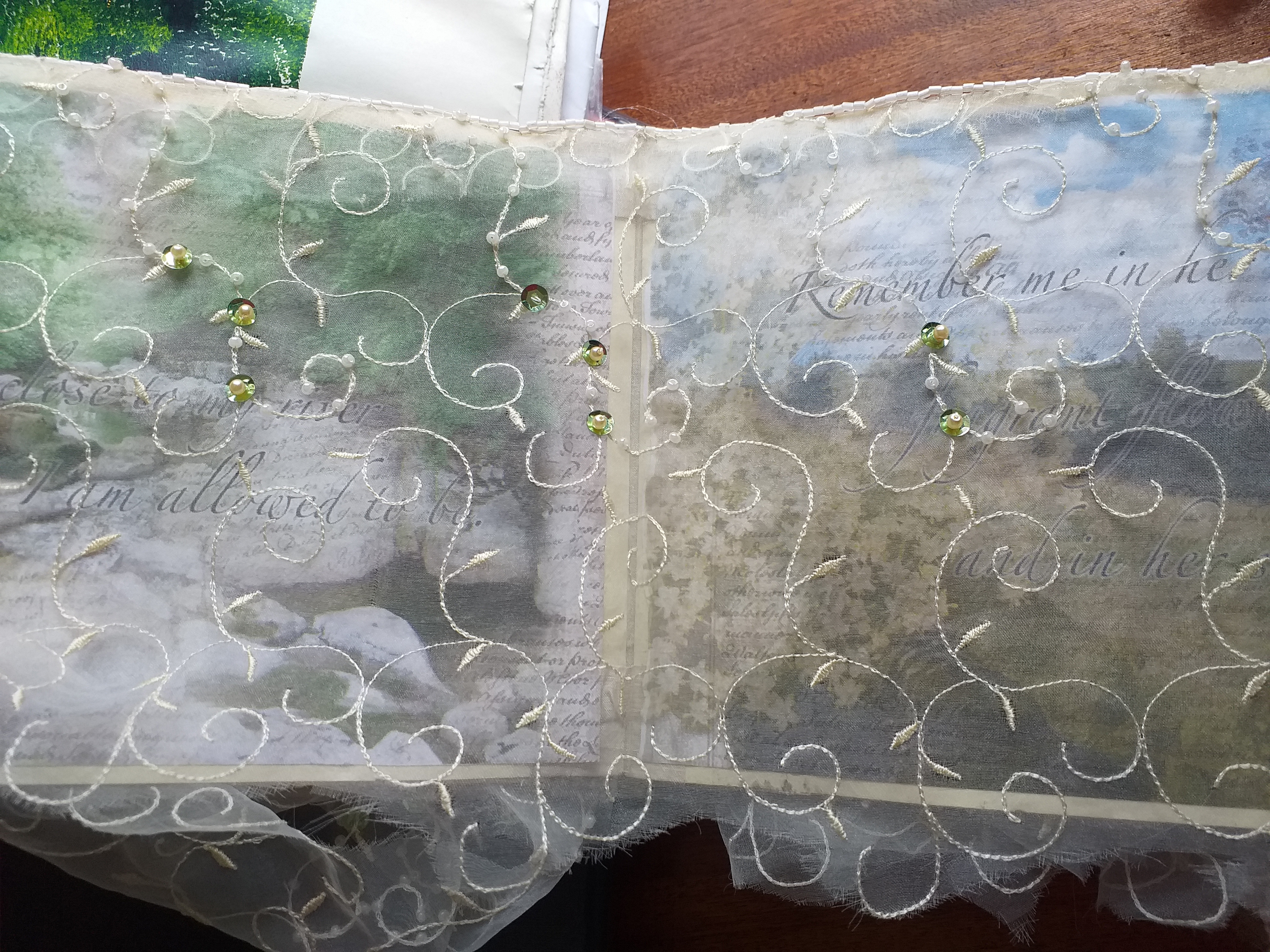
The book leaves represented in the picture above – in green card – will support the printed images of my poem done in the Photoshop workshop. They will run through the first reading order section, sort of the zig-zag inwards, and lead to fabric covered openings in which the cream card features will be enclosed. These will be fabric covered (significant remnants) and close with the ceramic buttons I made. Within each of these fabric ‘chapters’ of the book will be pictures (from print workshop) words and mementos (collected/made ephemera as the assignment brief says) for my loved ones. The reading journey on the reverse side of the zig- zag section will be fabric covered with pieces developed since the textile workshop. All will be stitched in place with pieces of my wedding veil running along the pages to create a liminal obscurity. This will turn into the opened out enclosed space at the end of reading, to represent a shroud. The walls of the enclosed space will bear the Photoshop palimpsests of the Iam Dulcis poem. This is a huge amount of making and assembling to be getting on with. I have been in very early each morning this week and have stayed late after college to create extra studio time to plan into my work schedule. I have got everything planned down to the minute for the remainder of the project up to deadline and have even managed to squeeze in an elective life drawing session last Monday morning – a lovely relaxing interlude, quiet, away from the studio and the sense of frenzy that seems to have developed as this first, key assignment reaches deadline!
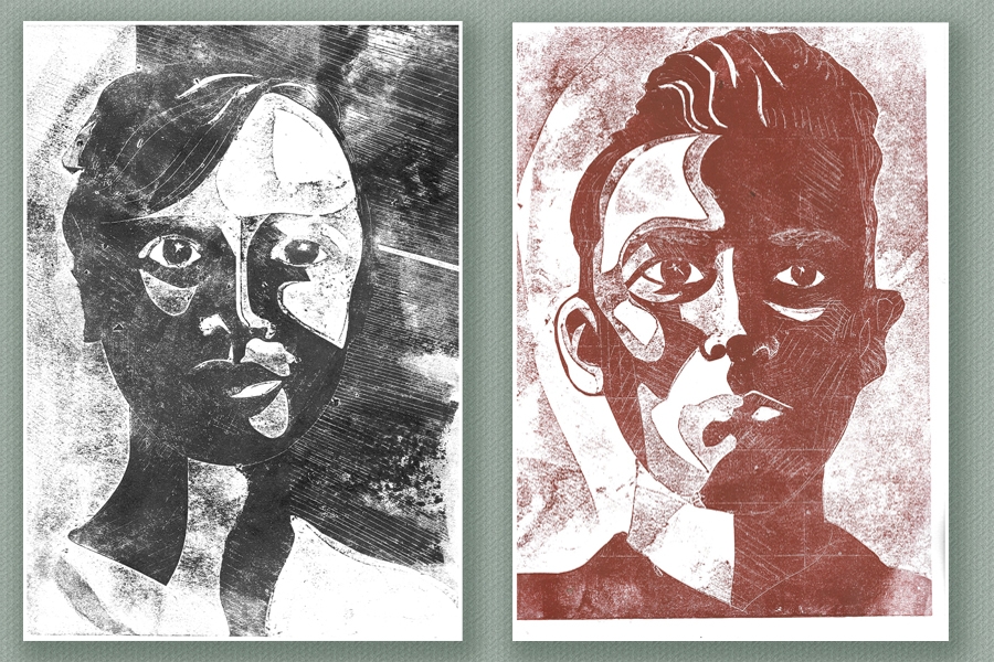
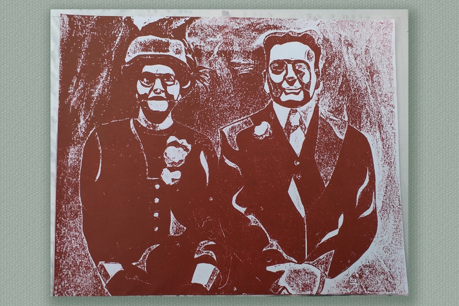
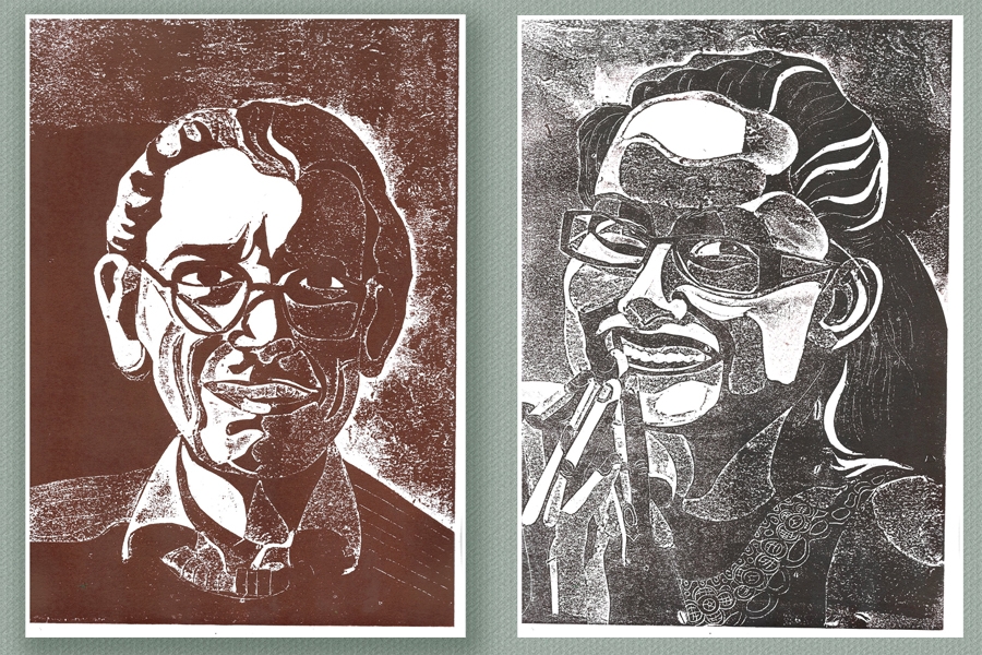
I am truly delighted with the way these have turned out and frankly rather embarrassed by the number of oos and aahs they are provoking in the studio but, I suppose that helps me to evaluate them less subjectively. I pinned them up on the wall next to my studio space (they’ll take ages to dry and the drying rack is full). I must admit, I was quite startled by seeing them from the outside of the studio window when I was stuck at the traffic lights this morning. The series certainly seems to have impact.
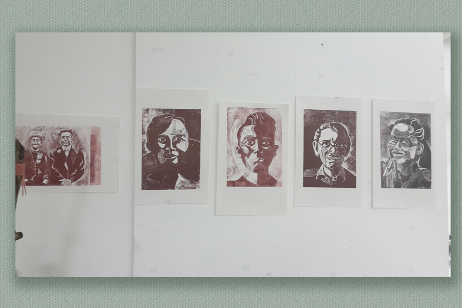
Never mind how startled I was, …… nothing compared to my husband’s face (no clue about the prints in production) when his image suddenly appeared on Instagram! #foundation.carlisle
Extension Activities.
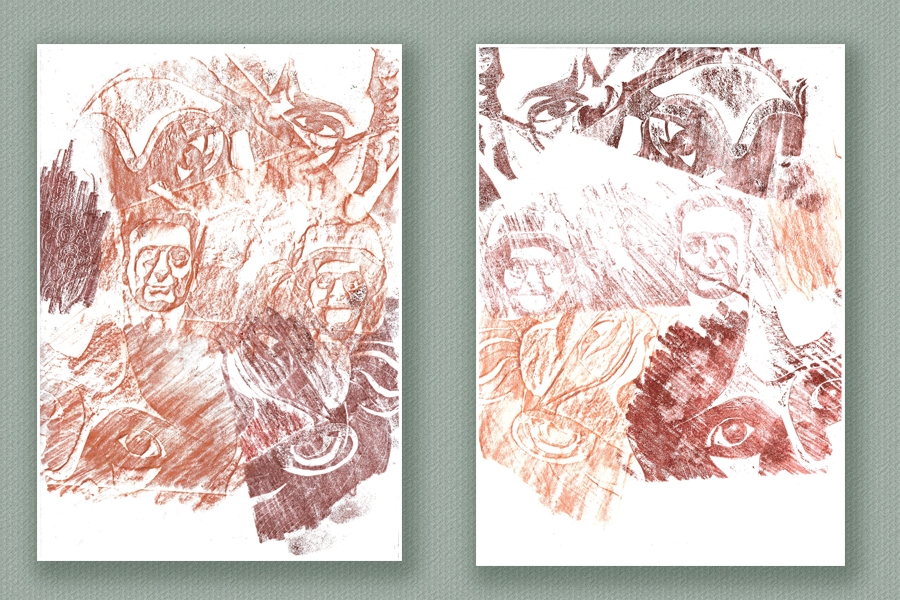
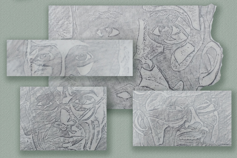
This playful extension may have been a bit inspired by the frottage I did of each board before printing from them. It seemed a nice way to preserve the virgin plates in a bit more interesting way than captures from the photocopy platen.
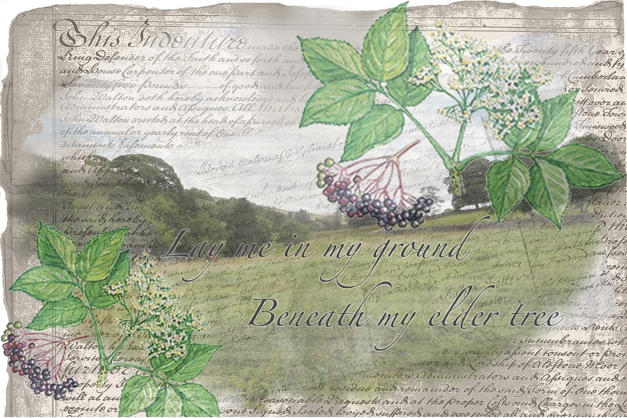
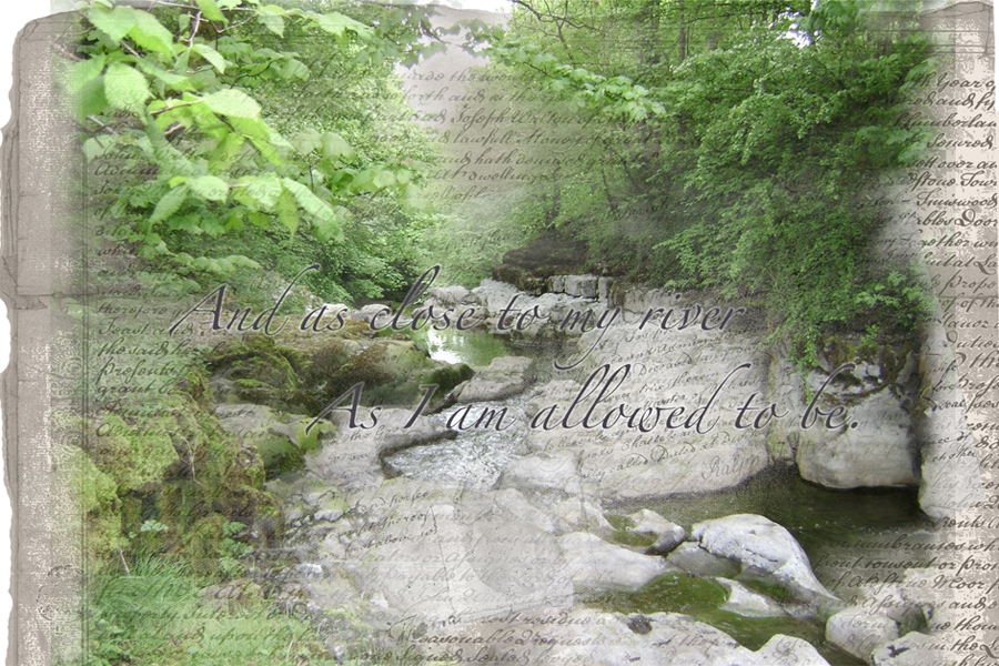
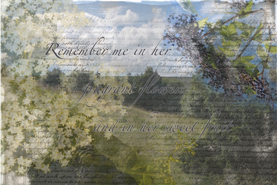
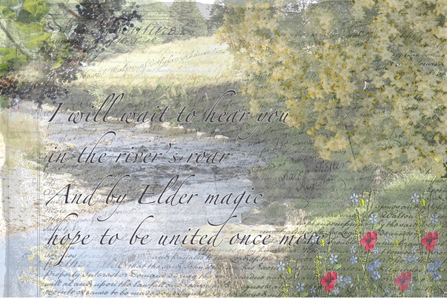
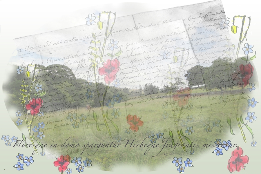
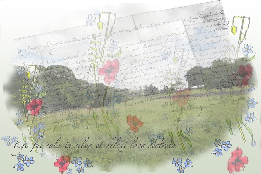


I feel that these have been successful in achieving a liminal effect using the layering and rubbing away palimpsest idea – representing the boundary between life and death. It has been a very time consuming process with a lot of decisions to be made about exact levels of opacity after the pixel level image editing. PT has given helpful support and little nudges in the right directions… particularly about font choice, colour etc and, finally in a discussion about the paper stock to use for printing.