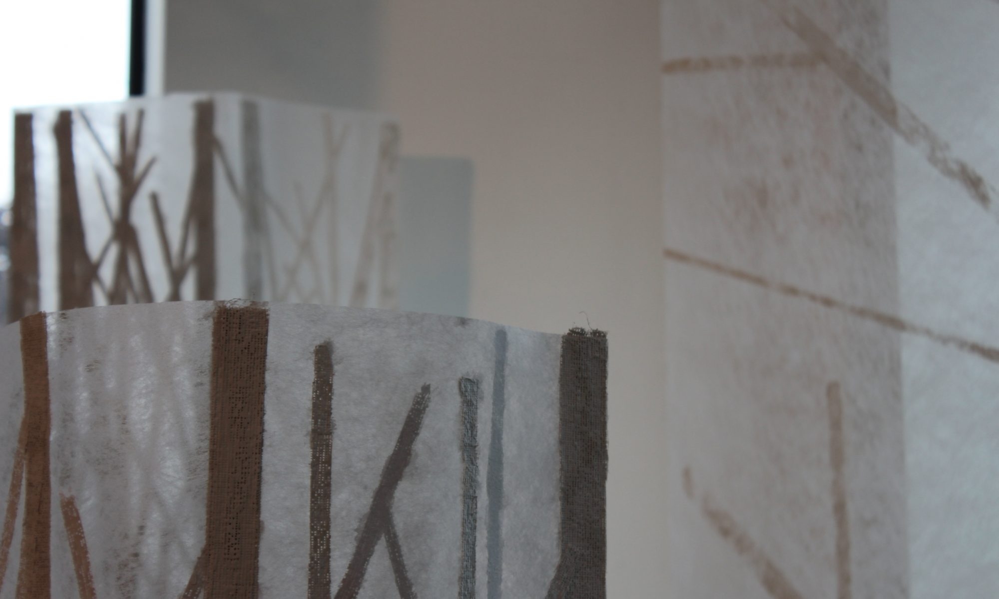
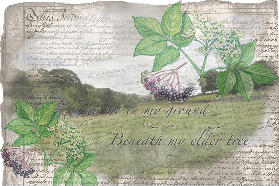
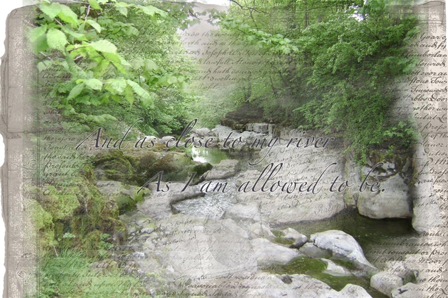
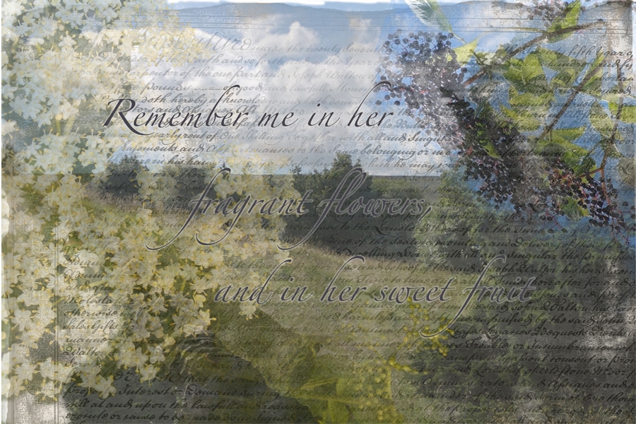
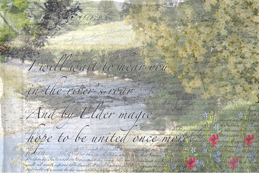
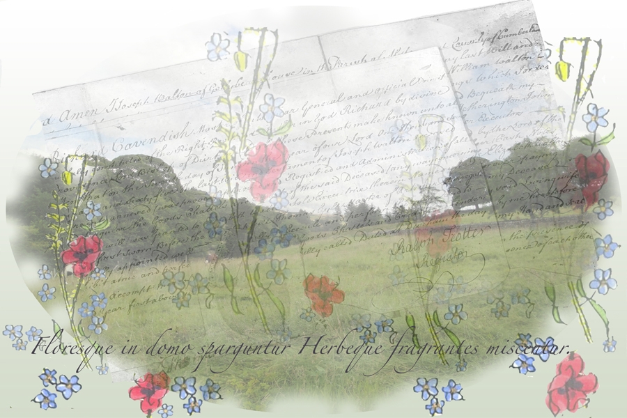
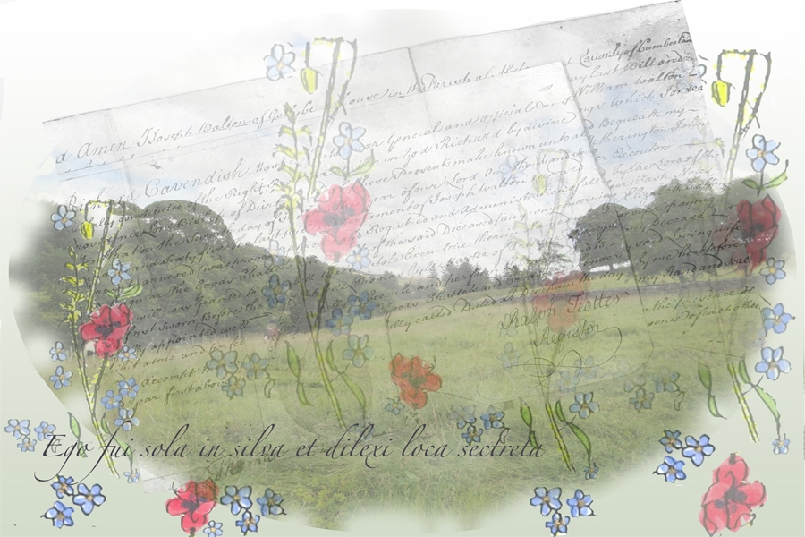
I feel that these have been successful in achieving a liminal effect using the layering and rubbing away palimpsest idea – representing the boundary between life and death. It has been a very time consuming process with a lot of decisions to be made about exact levels of opacity after the pixel level image editing. PT has given helpful support and little nudges in the right directions… particularly about font choice, colour etc and, finally in a discussion about the paper stock to use for printing.
Final Workshop: Photoshop 4th-5th October
I prepared a set of image files to take into workshop, material that I have decided to experiment with for my book. Since, last post, my ideas have been taking a more tangible form in my mind so I went into workshop armed with the deed scans, some images of elder flowers and berries, my poem script and some pictures of the landscape at home. The first few workshop activities were within my familiarity with Photoshop (I have used it for several years now) but I followed them through at the beginning just to find my way around the Mac environment and the CS6 version mounted there …. mine being a humble CS3 on Windows at home!
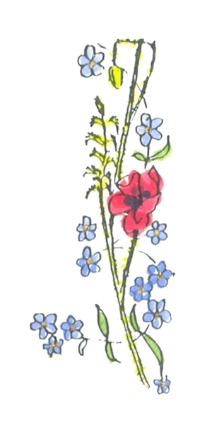
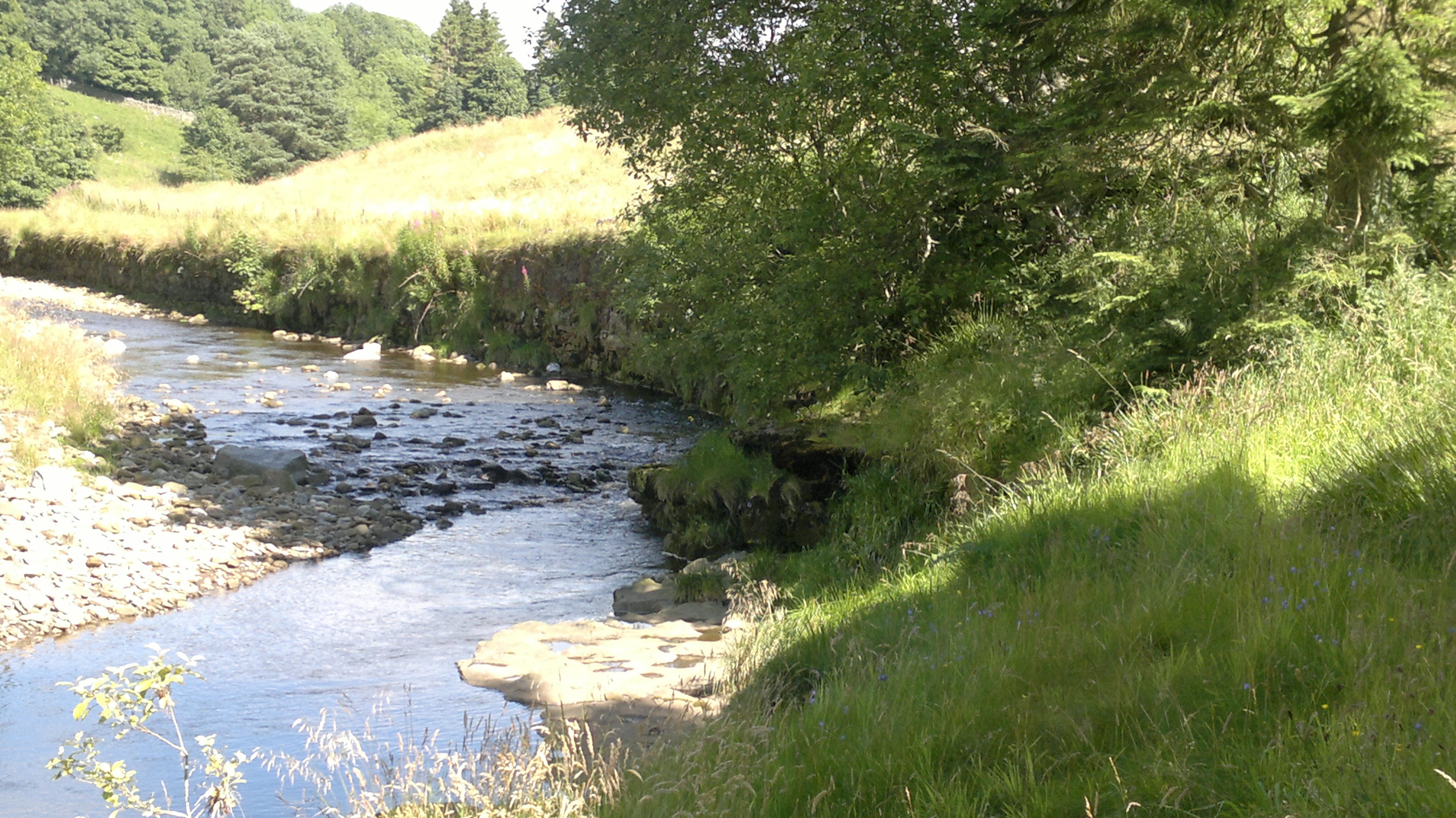
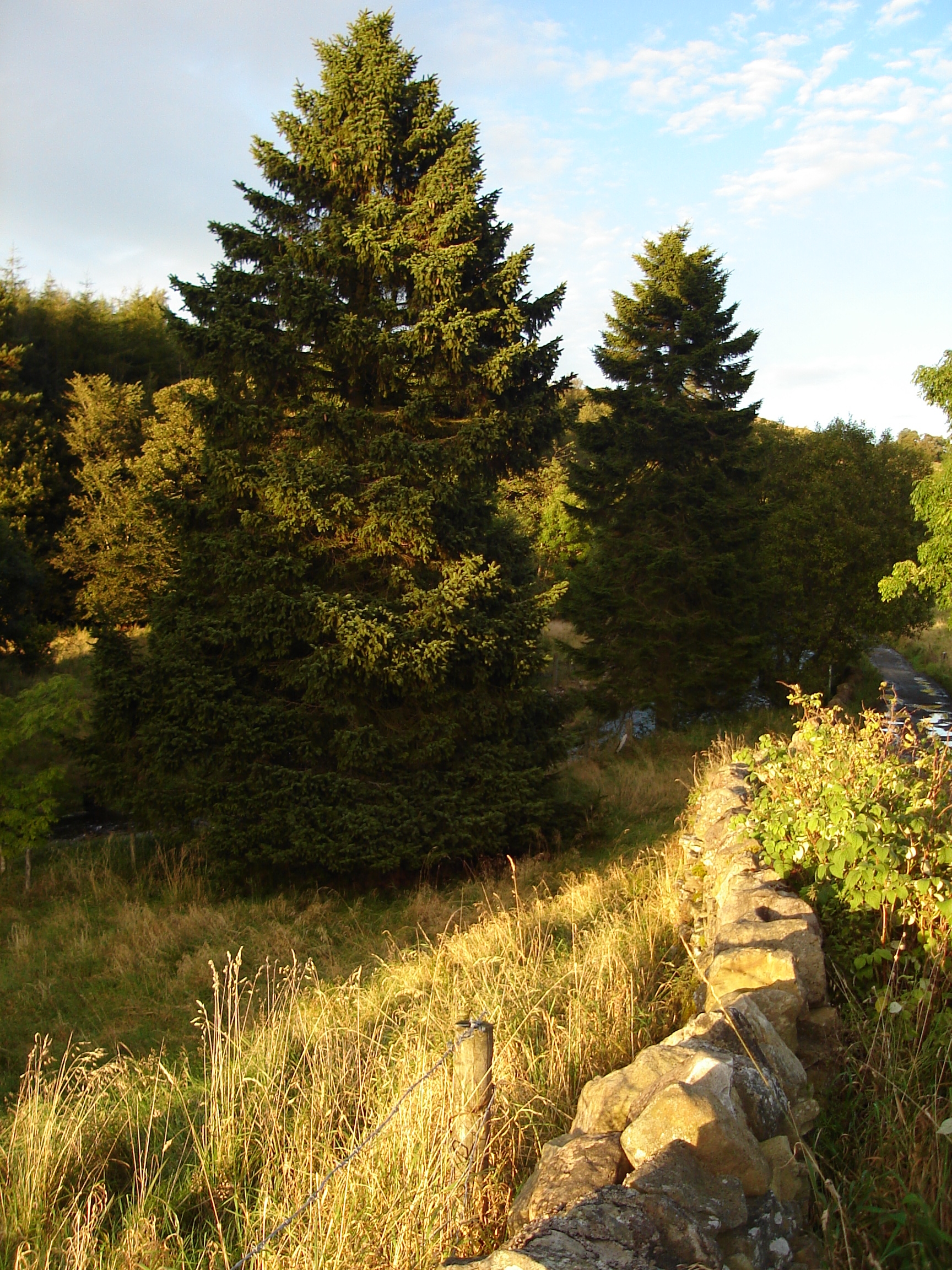
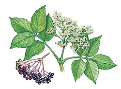
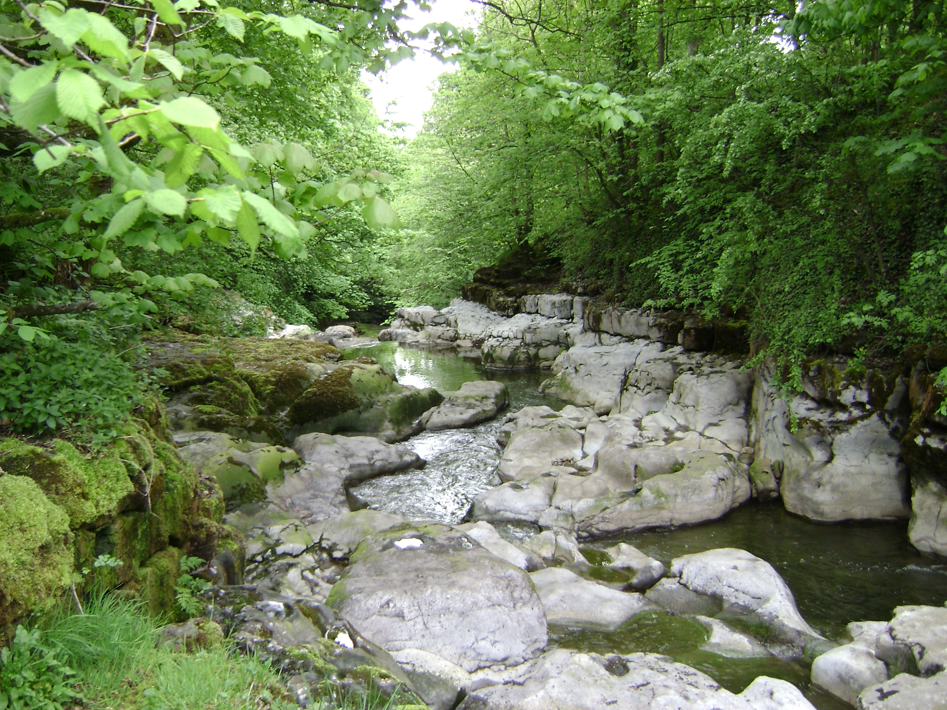
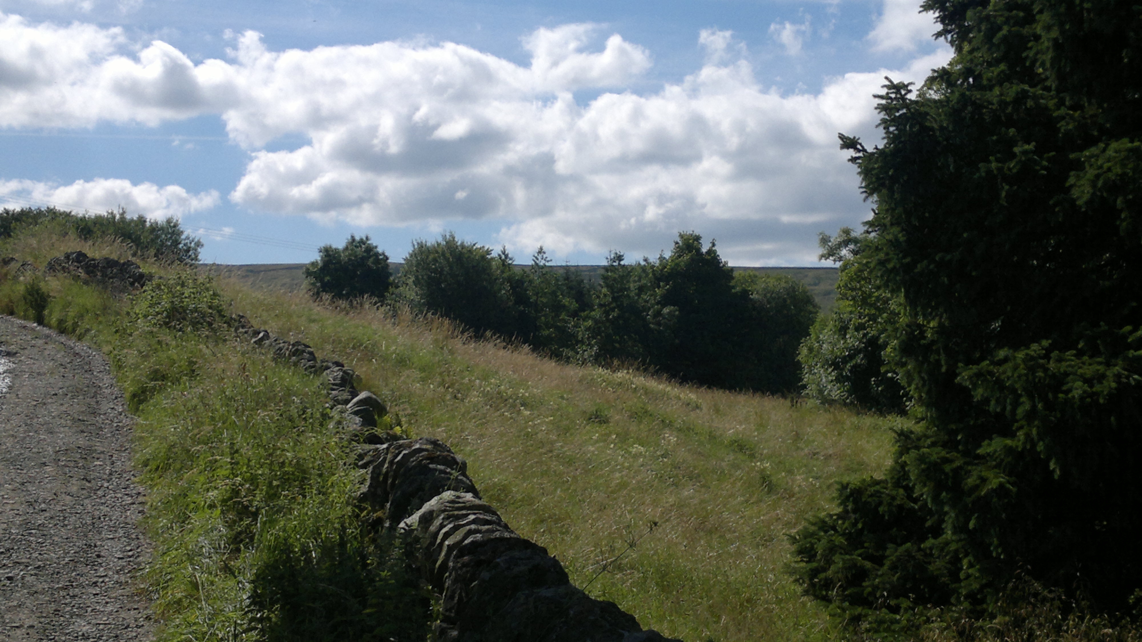
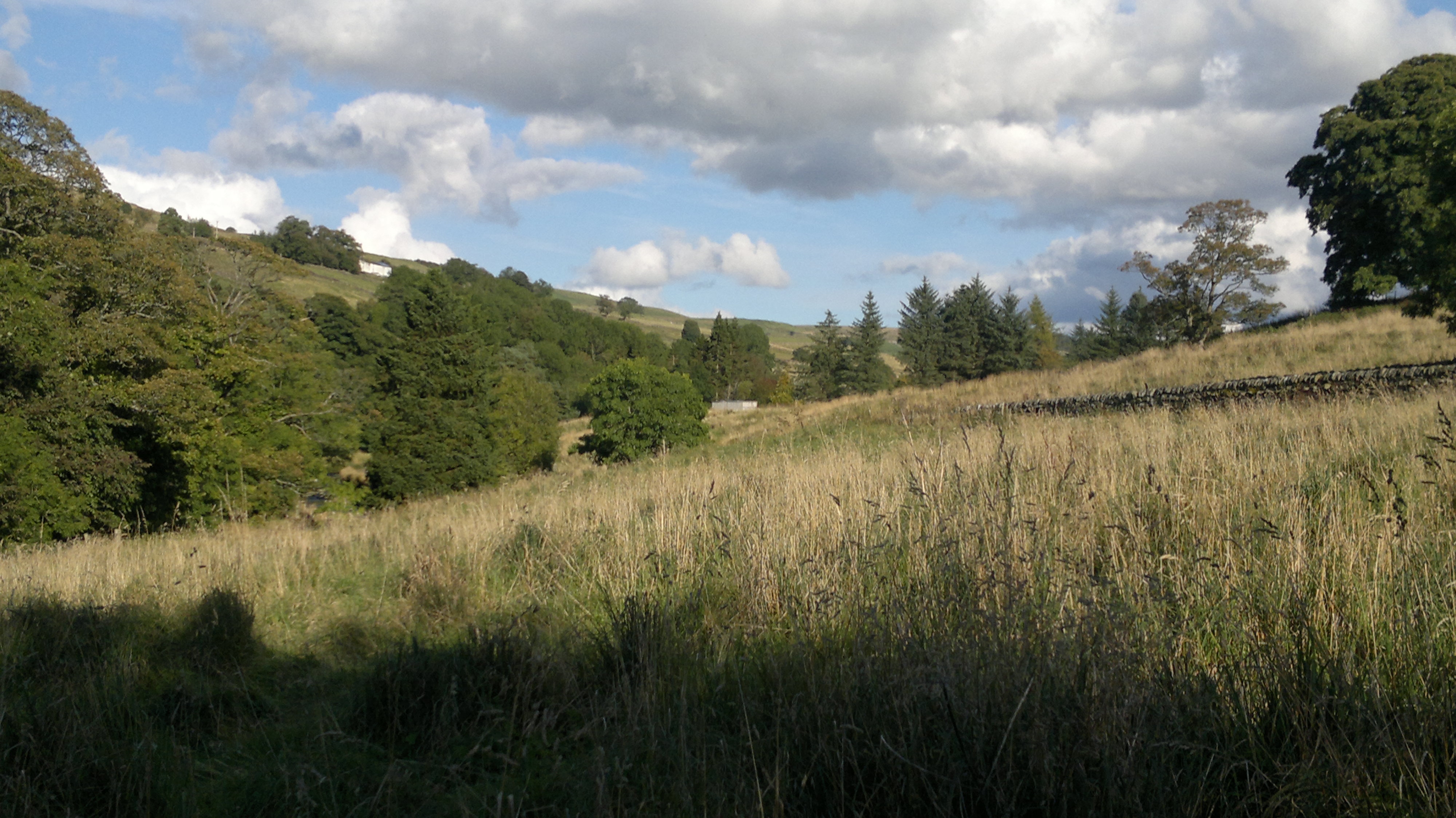
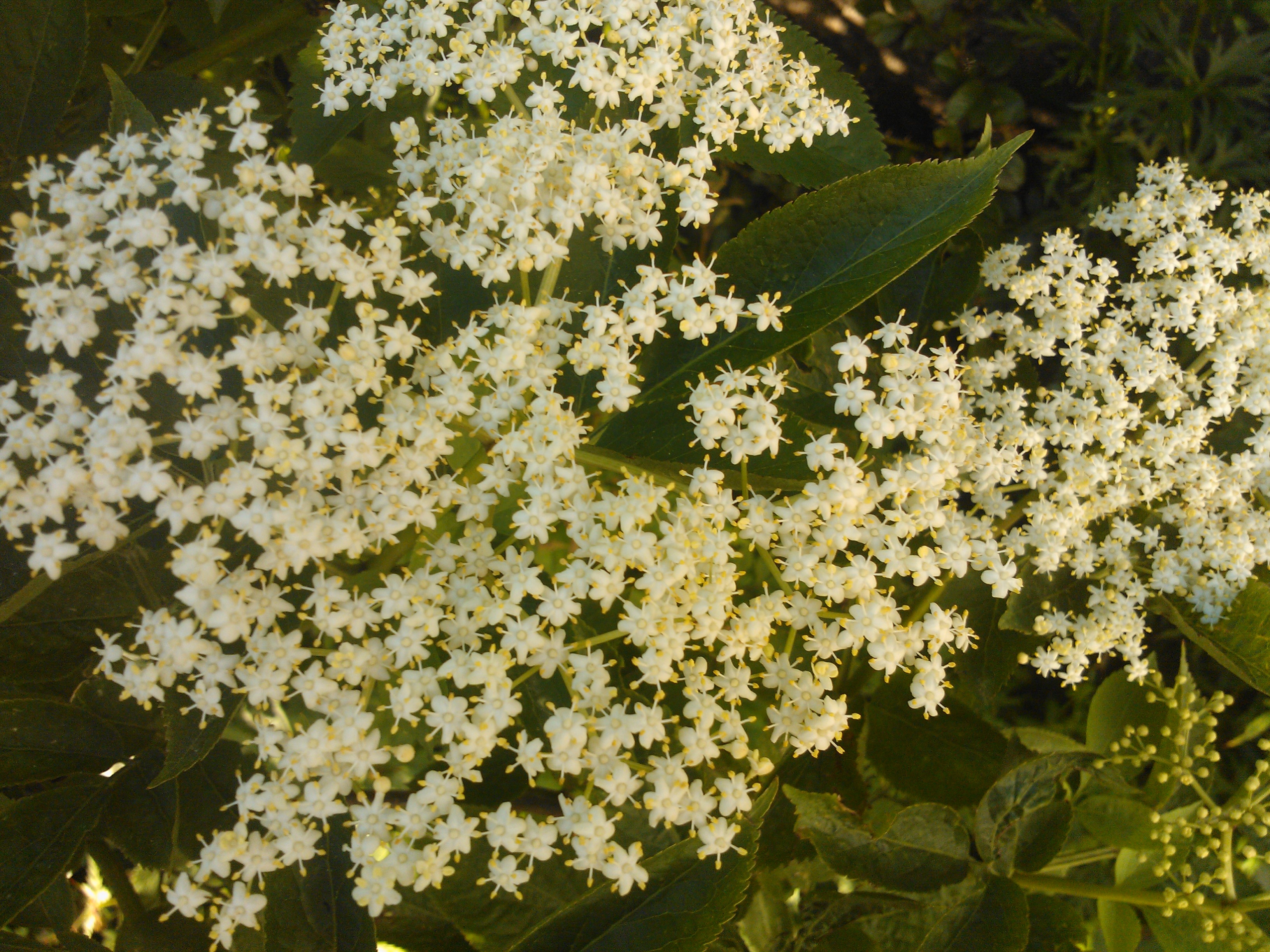
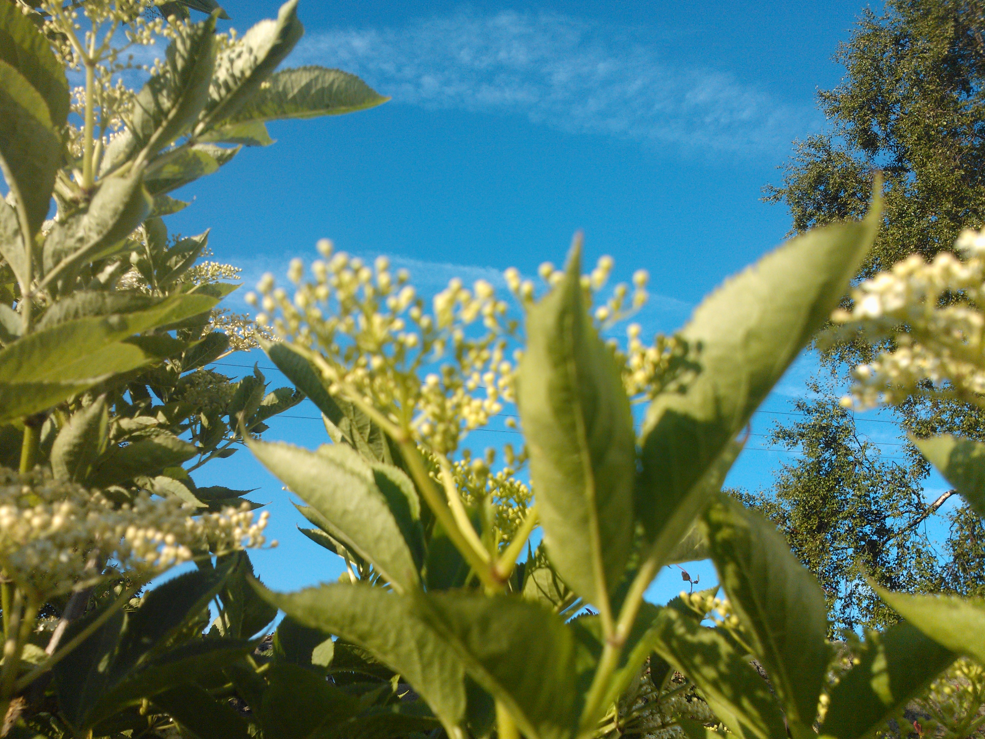
These pictures reference the themes I am including in my book. They include pictures of the landscape at mine, elders that I have grown, and a beautiful picture my husband took of the outflow of the waterfall at the bottom of our property, where it flows over the limestone. It is his favourite place. Also here is the illustration my Dad made to illustrate the poppies and blue flowers prose poem he wrote. My intention is to manipulate these images – going back to the palimpsest idea from early research to combine them with layers of text from my poem, the deed prints and text that my husband used in our orders of service when we got married – a medieval courtly love poem called The Iam Dulcis.
Workshop: Print Making 27th -28th September.
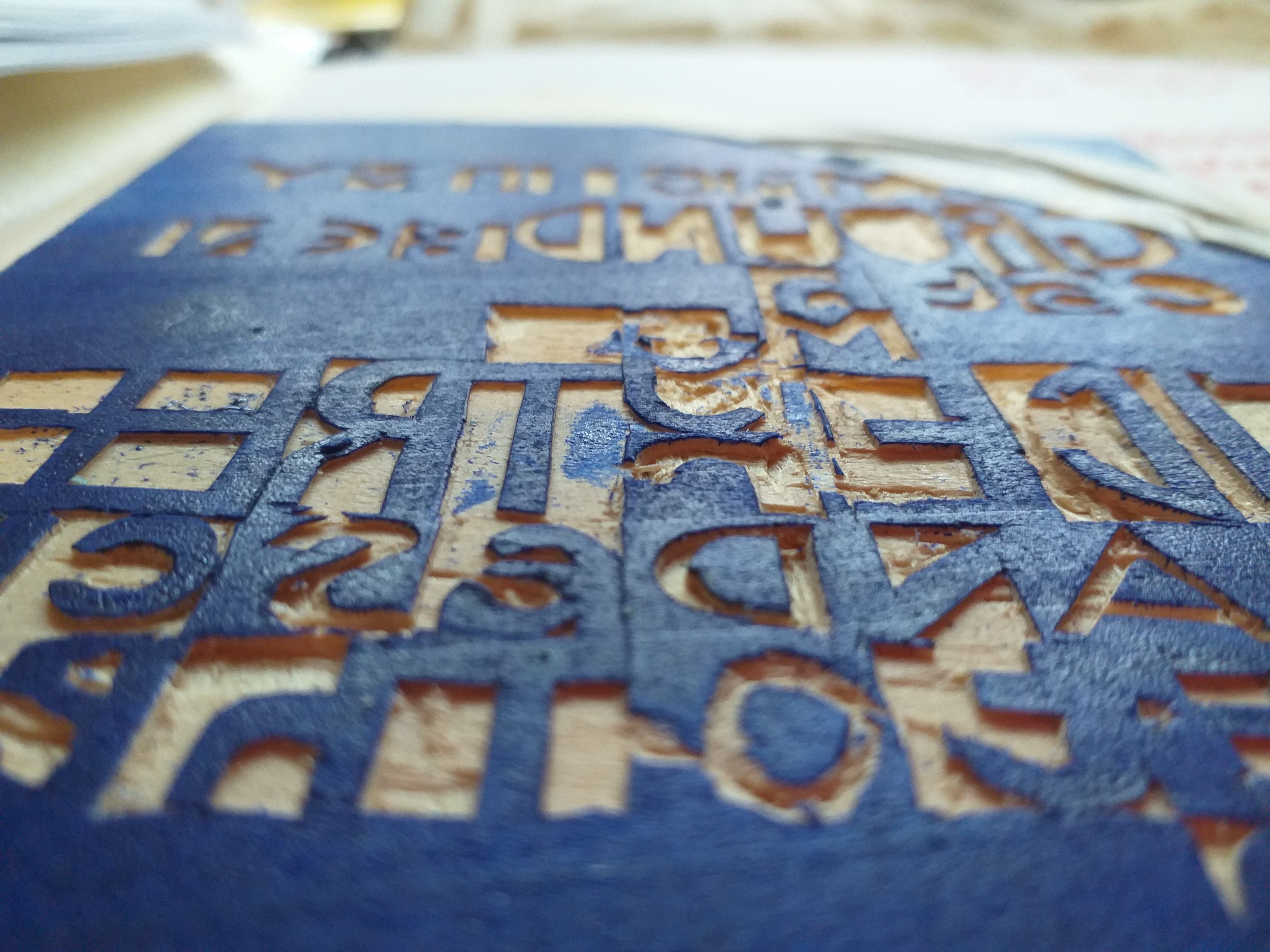
Day One. What joy! Find myself in my element. I am quite confident about printmaking and have previous experience of quite a few formal techniques: mono-print, lino, silk-screen, dry-point, Indian wood blocks, and less formal ones like using found surfaces and self made ‘blocks’ … then also, of course, watching Dad (much in mind again!) doing his ‘Bewick’ inspired work in box wood and copper etching and using the letter press. But, today was splendid mainly for the chance to try some new techniques like Japanese wood block. However, more of that later…
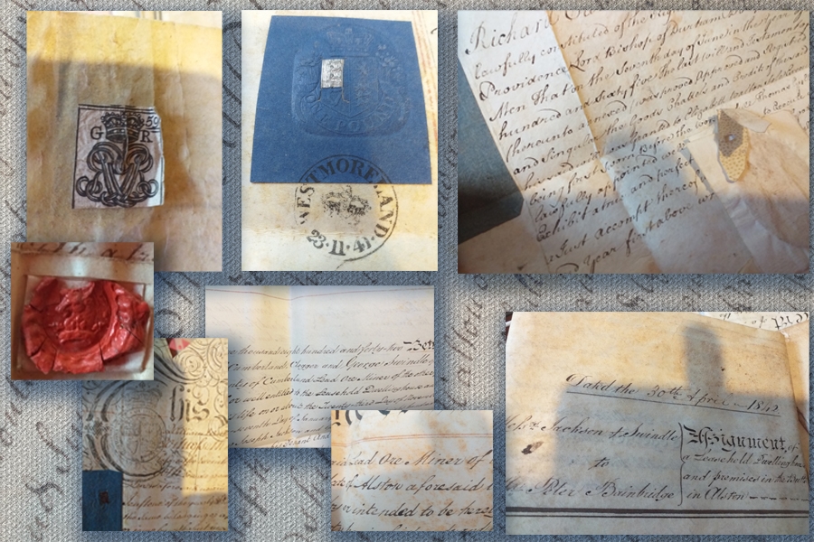
First, I began with photocopying and scanning the old deeds for my place – thinking I may overprint on them by way of developing ideas for my ‘Scrap That’ book. These are gorgeous artefacts dating back to 1746 in the reign of George II ? detailing title exchanges and indentures relating to the land which is now my allotment, garden, bit of river, woods and field, until its entry onto the land registry in 1988 as ‘land opposite (my house)’. The use they would have been putting it too of course, would have been prospecting in the mineral seams. I love to imagine the people present at the time the documents were being agreed and the sound of the quills on the parchment as the signatures were being done. The seals and stamps are intriguing. The archaic language is delicious and so are the details like ‘deed being made between such and such, clogger and the aforementioned other such and such miner of lead ore…..’. The way they give me a touch of this history is enchanting and it seems appropriate to use them somehow in my ‘legacy’ book.
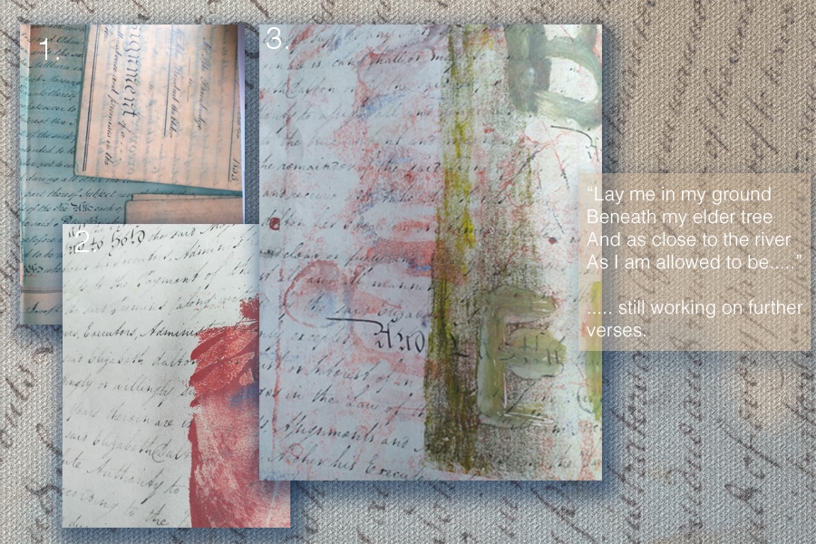
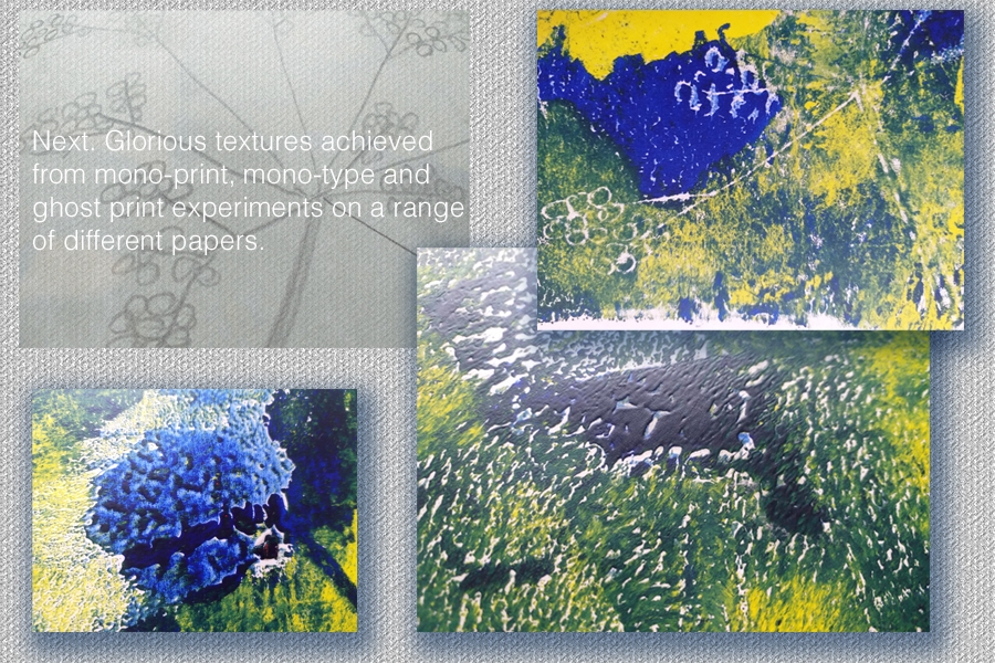
(Below) I was a bit disappointed in the way the photocopies came out (1.) Far too saturated for my liking and the glossy print quality didn’t take the ink very well. However, printing off the scanned images (2.) produced better results – more akin to the original documents and interesting results produced with mono- printing and mono-type experiments (3.) using words from my poem for the book ( as far as I’ve got it ….) and drawing elder flower/berry motifs.
What a glorious (messy) morning. Then, the p.m. was about Japanese wood block. It took an age to cut the lettering of the poem verse but, no injuries and only one letter that I forgot to reverse … an ‘a’ right in the centre of the block too – (how annoying).
